Microsoft Copilot
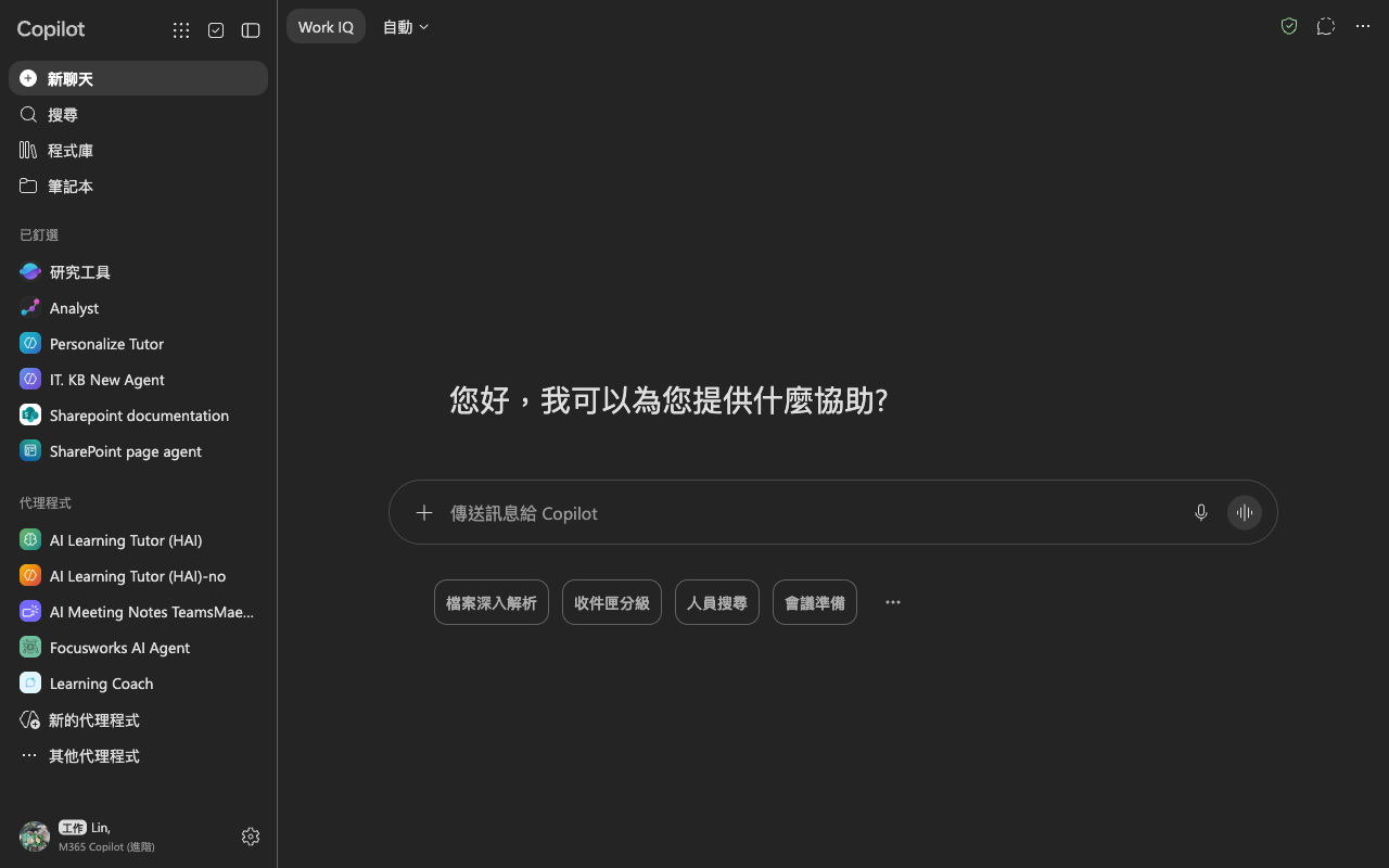

Design analysis
The landing page of Microsoft Copilot is a well-structured and user-friendly interface that effectively guides the user to the primary action. The layout is divided into two main sections, with the left side featuring a navigation menu and the right side displaying a prominent search bar and a call-to-action button. The visual hierarchy is clear, with the search bar and call-to-action button standing out in white against a dark grey background, while the navigation menu is displayed in a secondary colour. The use of typography is consistent throughout, with a clean and modern sans-serif font used for headings and body text. However, the font size and line spacing could be improved to enhance readability. Overall, the design is simple yet effective, making it easy for users to quickly find the information they need and take action.