DeepSeek
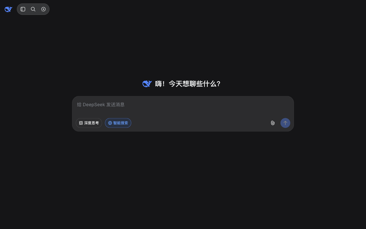

Design analysis
The landing page of DeepSeek presents a clean and organized layout, with a clear visual hierarchy that effectively guides the user's attention. The use of a dark grey background and blue accents creates a professional and trustworthy tone, while the prominent white text on the top right corner draws the user's focus to the primary action: searching for information. The search bar is prominently displayed, flanked by navigation links that provide easy access to other sections of the website. The typography is clear and readable, with headings and body text distinguished by size and weight, making it easy for the user to scan and understand the content. However, the page could benefit from additional visual elements, such as icons or images, to break up the text and add visual interest. Overall, the design is functional and effective, but could be further enhanced with additional visual elements to create a more engaging user experience.