Gemini
Design analysis
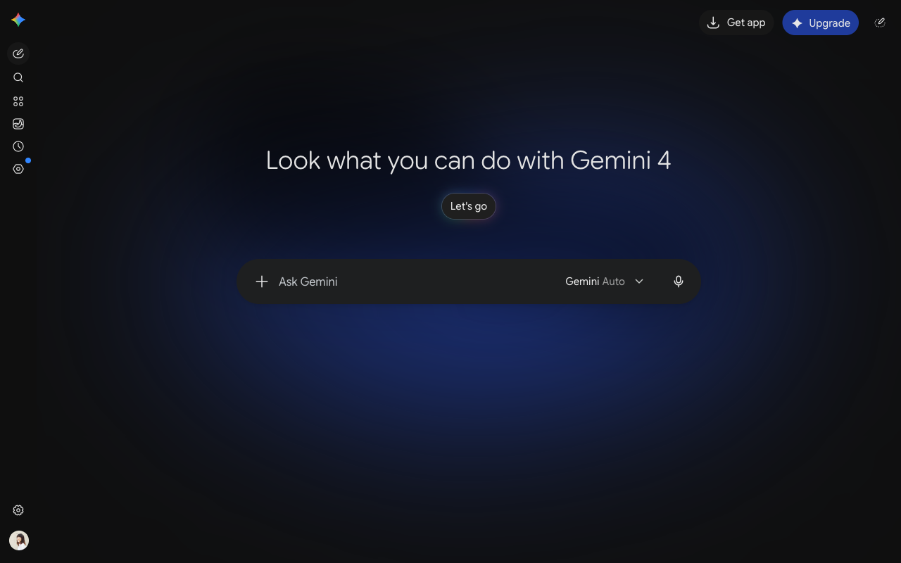
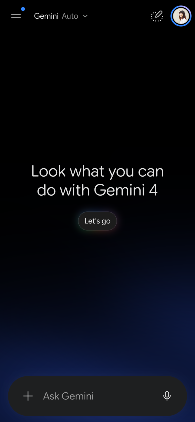
This shows the desktop version of Gemini for the week of 2026-10-12, before scrolling. A narrow column of icons without text labels runs down the left edge of the screen. The large heading in the middle stands out most on the screen. Even the dimmest text is light enough against the dark background to meet a common accessibility guideline. The message box has no visible outline, but the hint text inside it is easy to read. You start in the message box in the middle of the screen. There are no suggested prompts on the screen. No note that it can make mistakes is visible. The label of the menu in the message box changed from Flash Extended to Gemini Auto. The heading text differs from the week of 2026-10-05.