Kimi
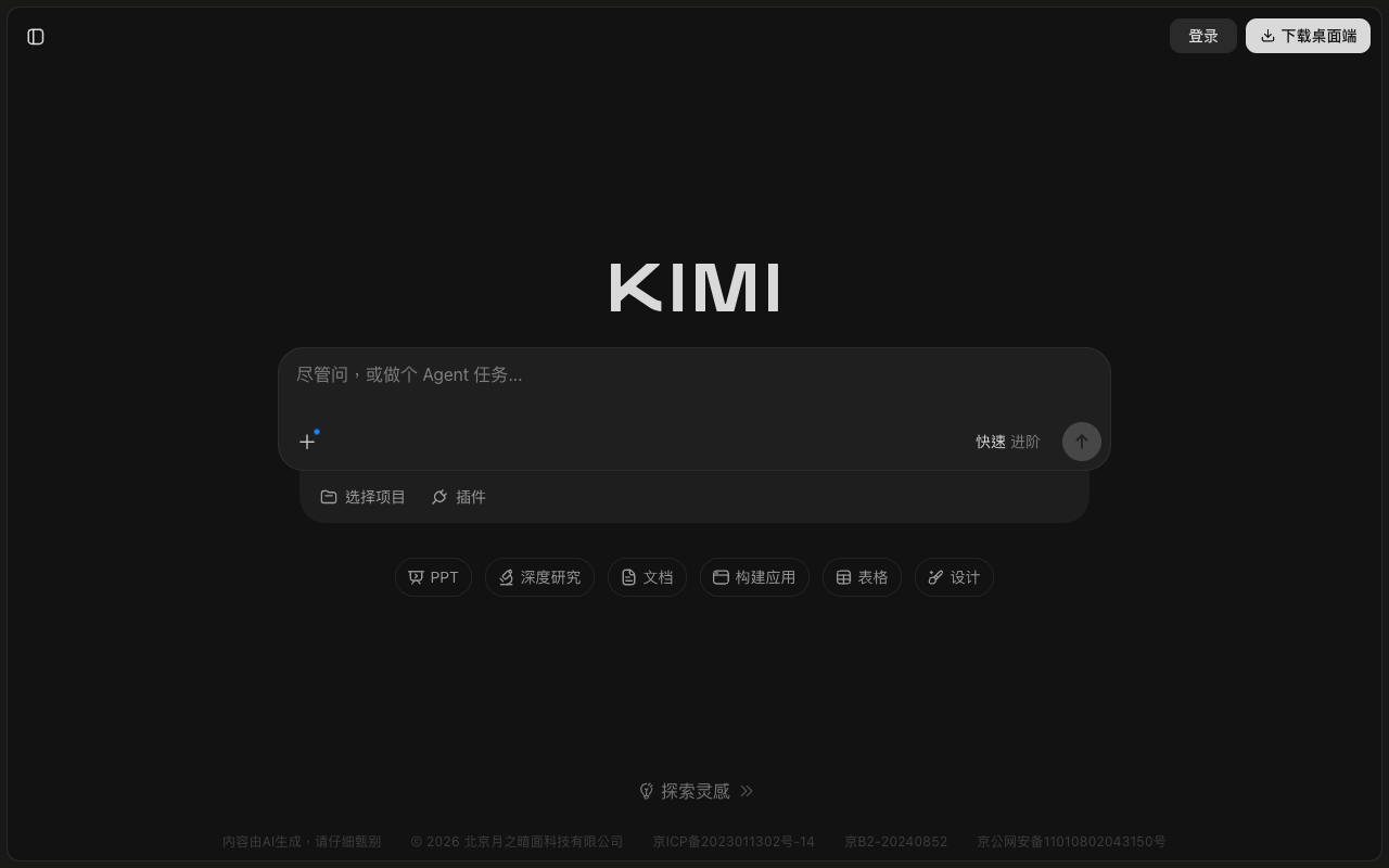
Design analysis
The landing page of Kimi by Moonshot AI presents a clean and modern design that effectively guides the user to the primary action of signing up. The layout is straightforward, with a prominent call-to-action (CTA) button at the top of the page, accompanied by a brief description of the service and its benefits. The use of a dark grey background and white text creates a visually appealing contrast, while the typography is clear and easy to read. The visual hierarchy is well-organized, with the CTA button standing out as the most prominent element on the page. However, the page could benefit from additional visual interest, such as images or icons, to break up the text and create a more engaging user experience. Overall, the design is well-executed and effectively communicates the value proposition of Kimi, making it easy for users to understand the service and take the desired action.