Le Chat
Design analysis
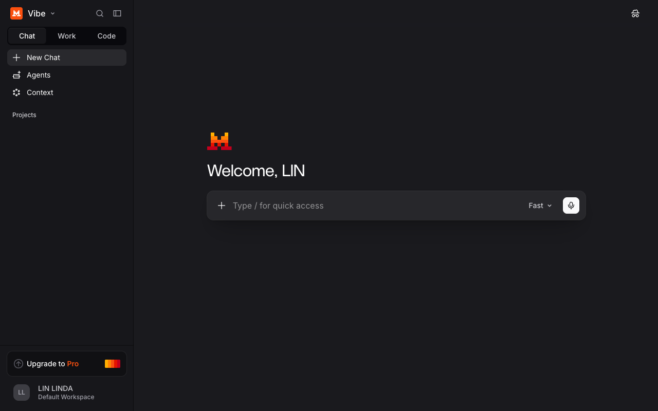
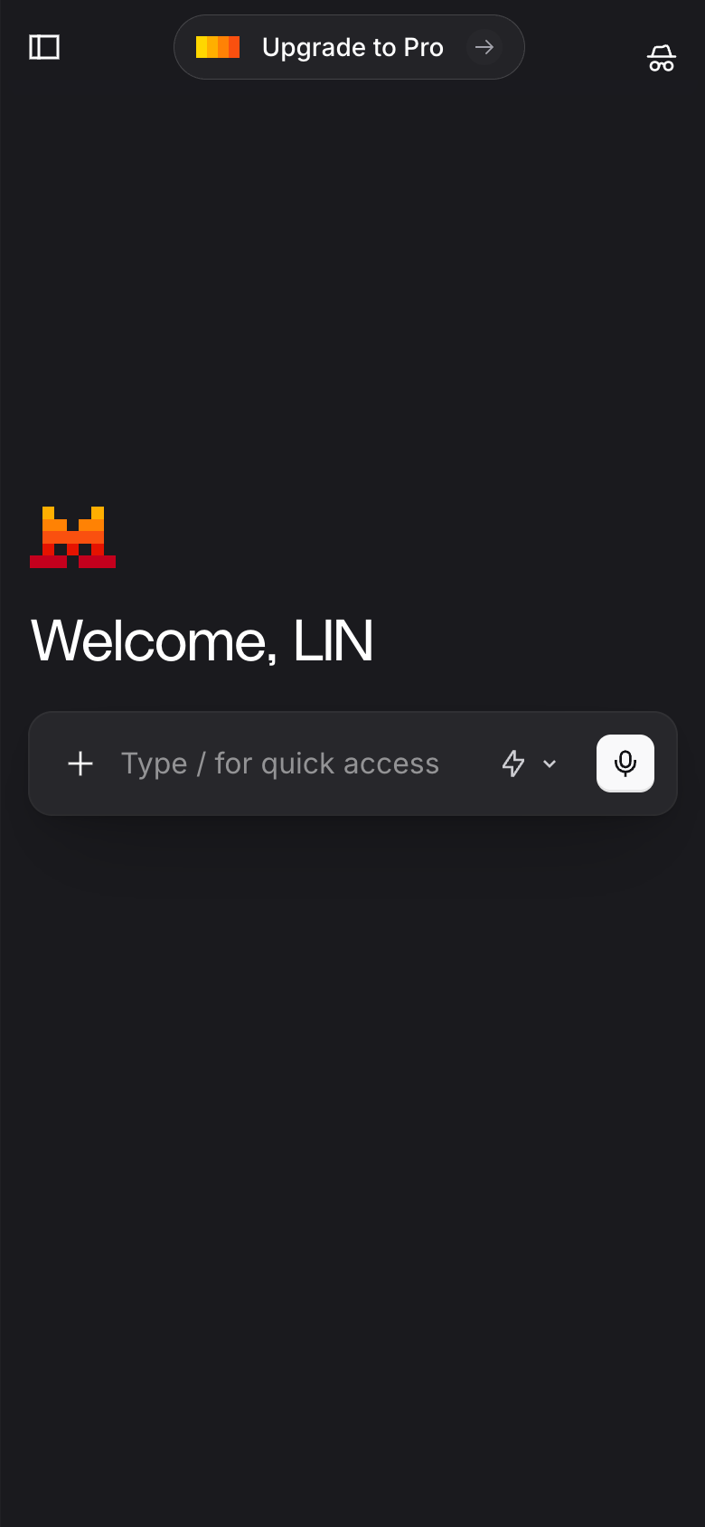
The landing page of Le Chat by Mistral AI is a well-crafted design that effectively guides the user to the primary action. The layout is clean and simple, with a clear visual hierarchy that draws the user's attention to the central call-to-action (CTA) button. The use of color is limited to a muted palette of whites, grays, and blues, which creates a sense of calmness and professionalism. The typography is clear and easy to read, with a focus on sans-serif fonts that provide a clean and modern feel. The page is well-organized, with clear headings and concise paragraphs that provide a clear overview of the product's features and benefits. Overall, the design is effective in guiding the user to the primary action, which is to sign up for a free trial of the product. **Answer:** The landing page of Le Chat by Mistral AI is a well-crafted design that effectively guides the user to the primary action, with a clean and simple layout, limited color palette, clear typography, and well-organized content.