Perplexity
Design analysis
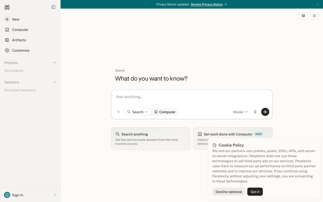
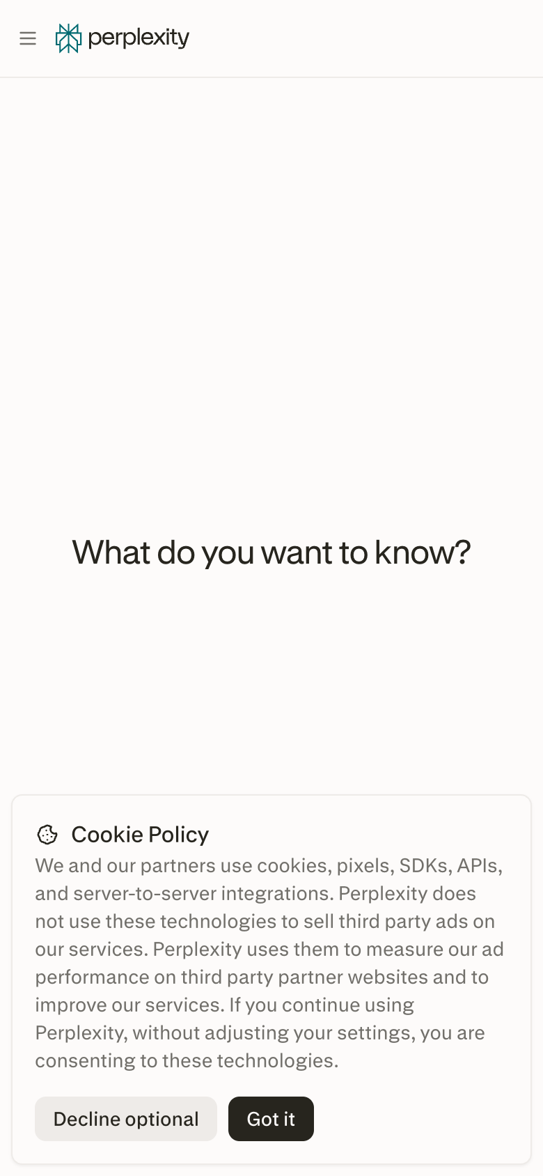
The landing page of Perplexity by Perplexity AI presents a clean and modern design that effectively guides users to the primary action of asking a question. The layout is organized into three main sections: a search bar at the top, a prominent call-to-action (CTA) button below, and a list of featured questions to the right. The visual hierarchy is clear, with the search bar and CTA button standing out due to their large size and bold typography. The use of a dark green background and white text creates a cohesive and professional look, while the subtle use of icons and graphics adds visual interest without overwhelming the user. The overall design is well-balanced, making it easy for users to focus on the task at hand and quickly find the information they need. **Answer:** The landing page of Perplexity by Perplexity AI is a well-designed and user-friendly interface that effectively guides users to the primary action of asking a question.