Perplexity
Design analysis
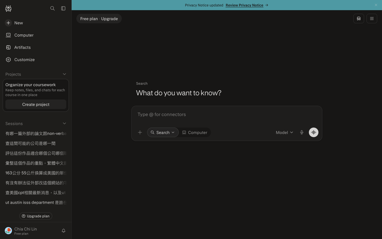
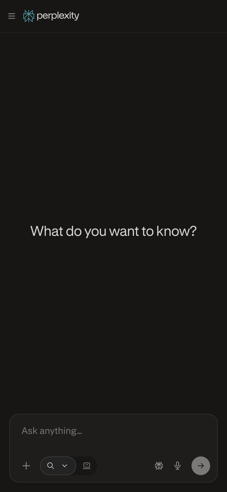
The landing page of Perplexity by Perplexity AI features a clean and intuitive layout, with a clear visual hierarchy that effectively guides the user's attention to the primary action. The use of a calming blue-green color scheme creates a sense of trust and approachability, while the bold headings and concise body text in a clean sans-serif font make it easy to quickly scan and understand the content. The prominent call-to-action (CTA) button, "Get Started," is strategically placed at the center of the page, drawing the user's eye and encouraging them to take the next step. However, the page could benefit from more whitespace to improve readability and reduce visual clutter, and the use of a sans-serif font for the body text may not be the most effective choice for a product that aims to provide in-depth information and insights. Overall, the design is well-intentioned but could be refined to better support the user's journey and provide a more engaging experience.