Pi
Design analysis
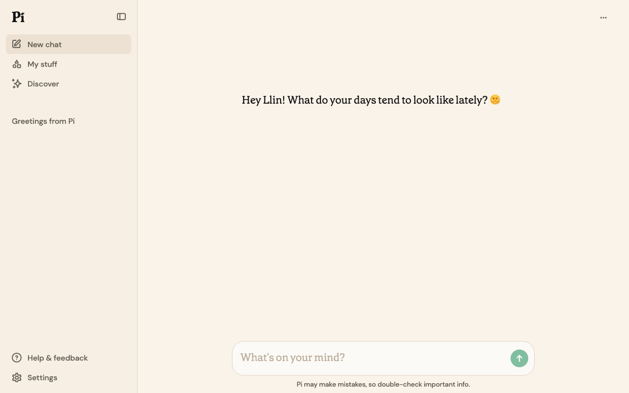
The landing page of Pi by Inflection AI presents a clean and organized layout, with a clear visual hierarchy that guides the user's attention to the primary action. The use of a light beige background and black text creates a neutral and professional tone, while the prominent display of the search bar at the top center of the page draws the user's focus to the primary action. The typography is clear and readable, with a sans-serif font used throughout the page. However, the lack of visual interest and the absence of a clear call-to-action (CTA) button may lead to user confusion and make it difficult for them to understand what action to take next. Overall, while the page is well-organized and easy to navigate, it could benefit from additional visual elements and a clearer CTA to enhance the user experience.