Poe
Design analysis
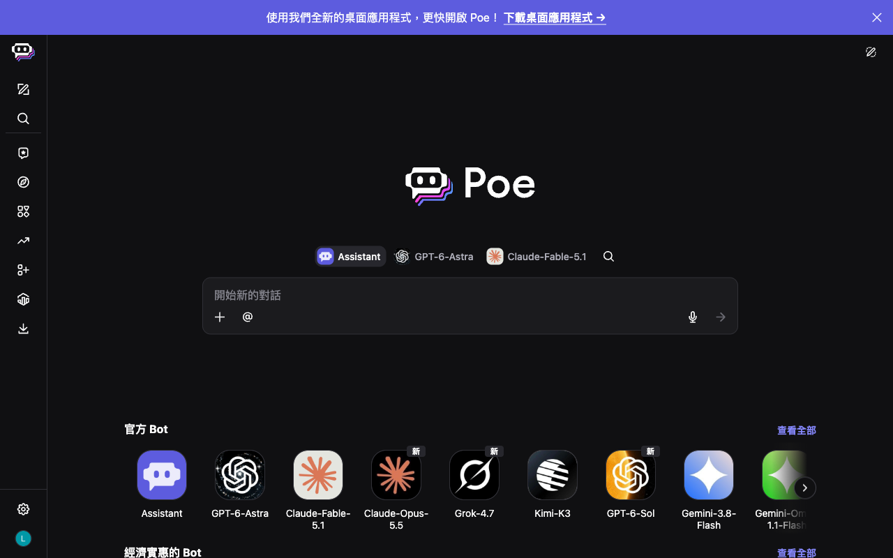
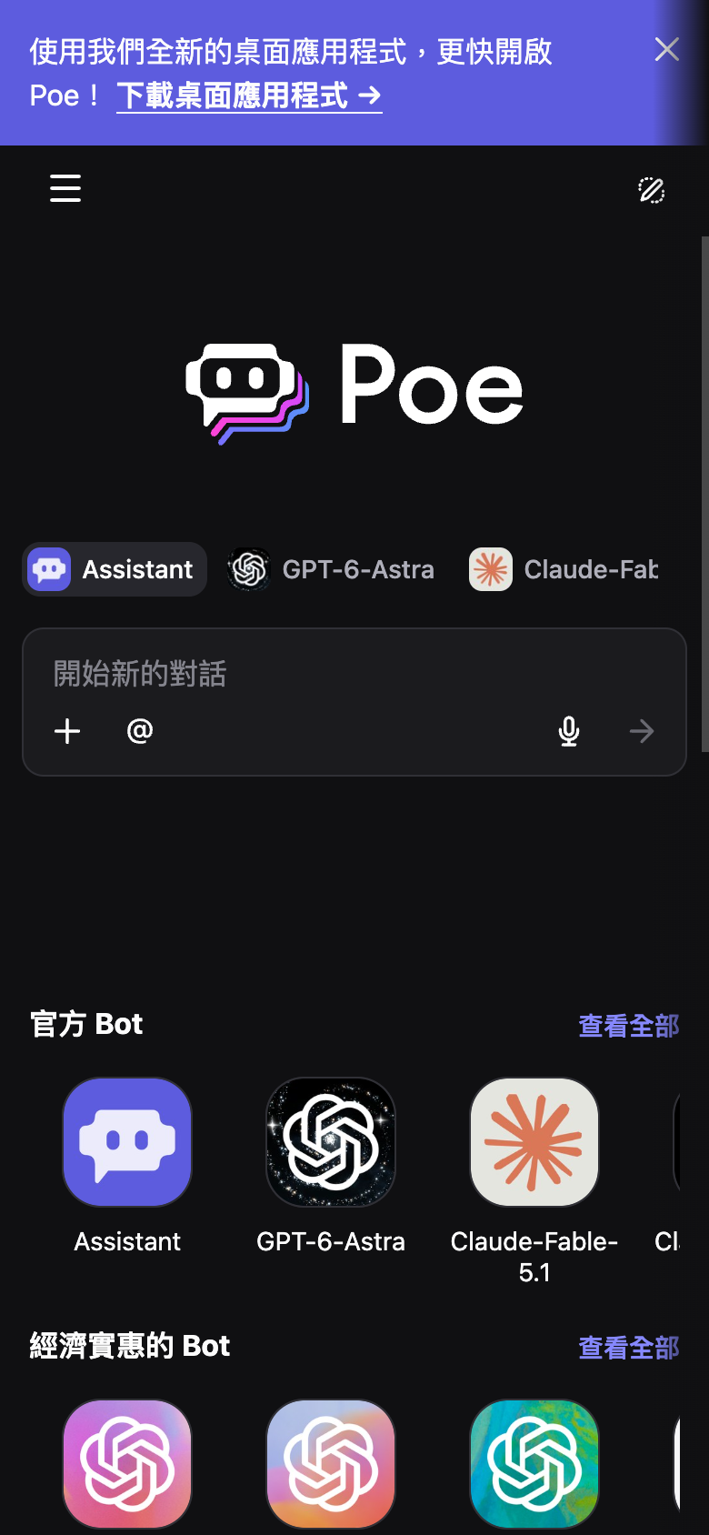
The landing page of Poe by Quora features a clean and modern design that effectively guides users to the primary action. The layout is organized into clear sections, with the search bar prominently displayed at the top, accompanied by a row of icons for various tools and features. The use of a dark grey background and white text creates a visually appealing contrast, while the subtle use of orange accents adds a touch of warmth and personality. The typography is clear and easy to read, with headings and subheadings used to create a clear visual hierarchy. Overall, the design is well-balanced and easy to navigate, making it an effective UI reference library.