Qwen Chat
Design analysis
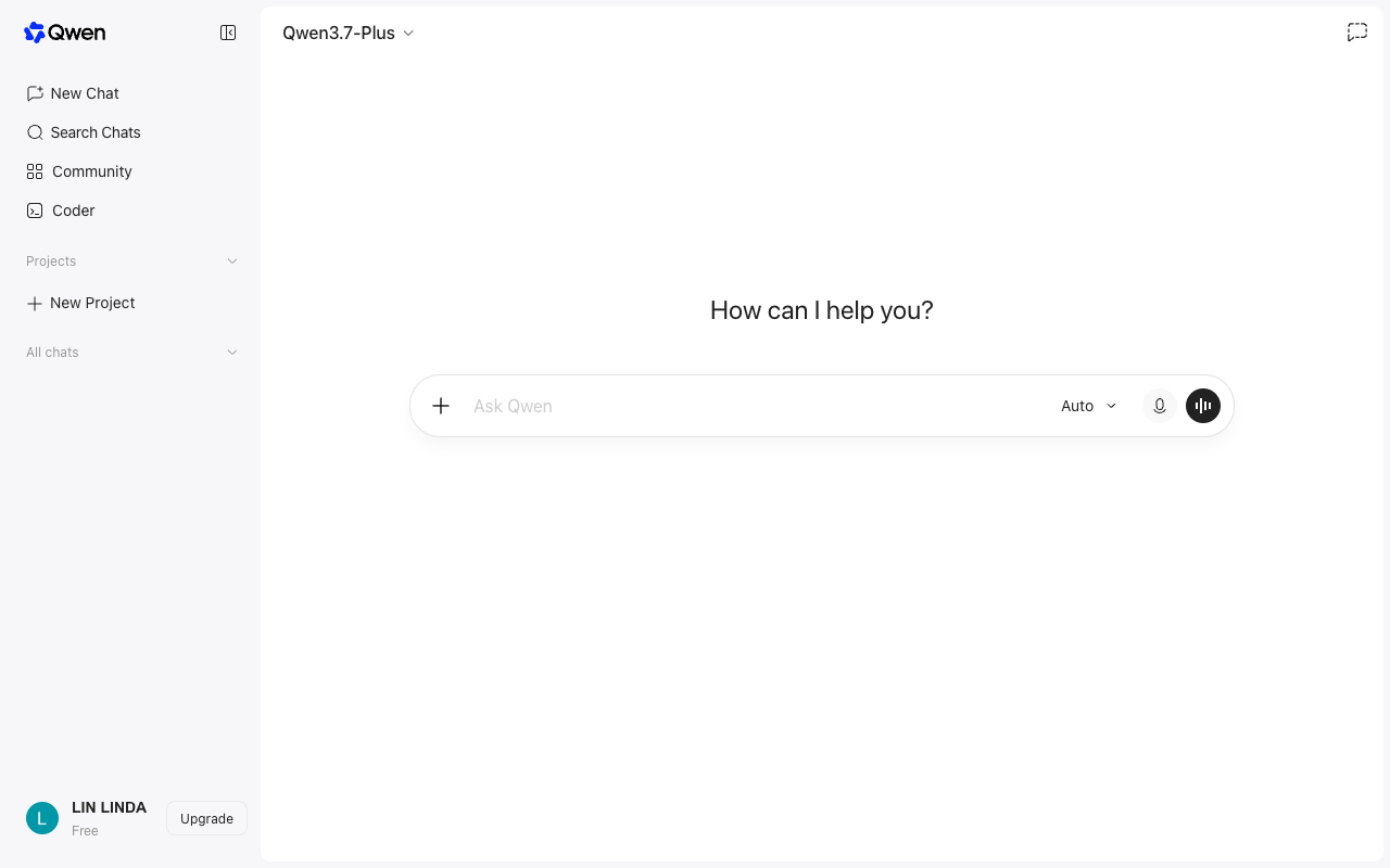
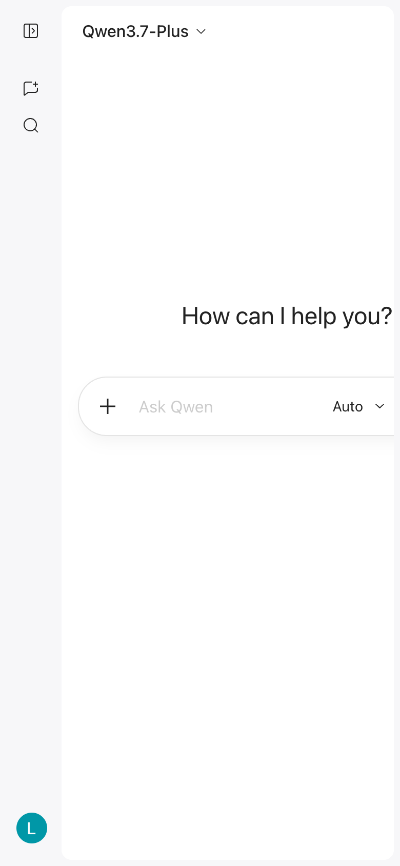
The Qwen Chat landing page, designed by Alibaba, features a clean and intuitive layout that effectively guides users to the primary action. The page is divided into two main sections: a navigation menu on the left and a central content area. The navigation menu is organized in a clear and logical manner, with distinct sections for different types of chats, such as "New Chat" and "Search Chats." The central content area is dominated by a prominent call-to-action (CTA) button, "Ask Qwen," which is displayed in a large font size and a contrasting color scheme to draw attention. The use of a white background and subtle gray accents creates a sense of minimalism and simplicity, while the typography is clear and easy to read. However, the page could benefit from a more prominent header or logo to establish brand identity and provide context for the user. Additionally, the layout could be further optimized for mobile devices, as the navigation menu may be difficult to access on smaller screens. Overall, while the Qwen Chat landing page is well-designed and effective in guiding users to the primary action, there is room for improvement in terms of branding and mobile usability.