DeepSeek vs Muse: UI comparison
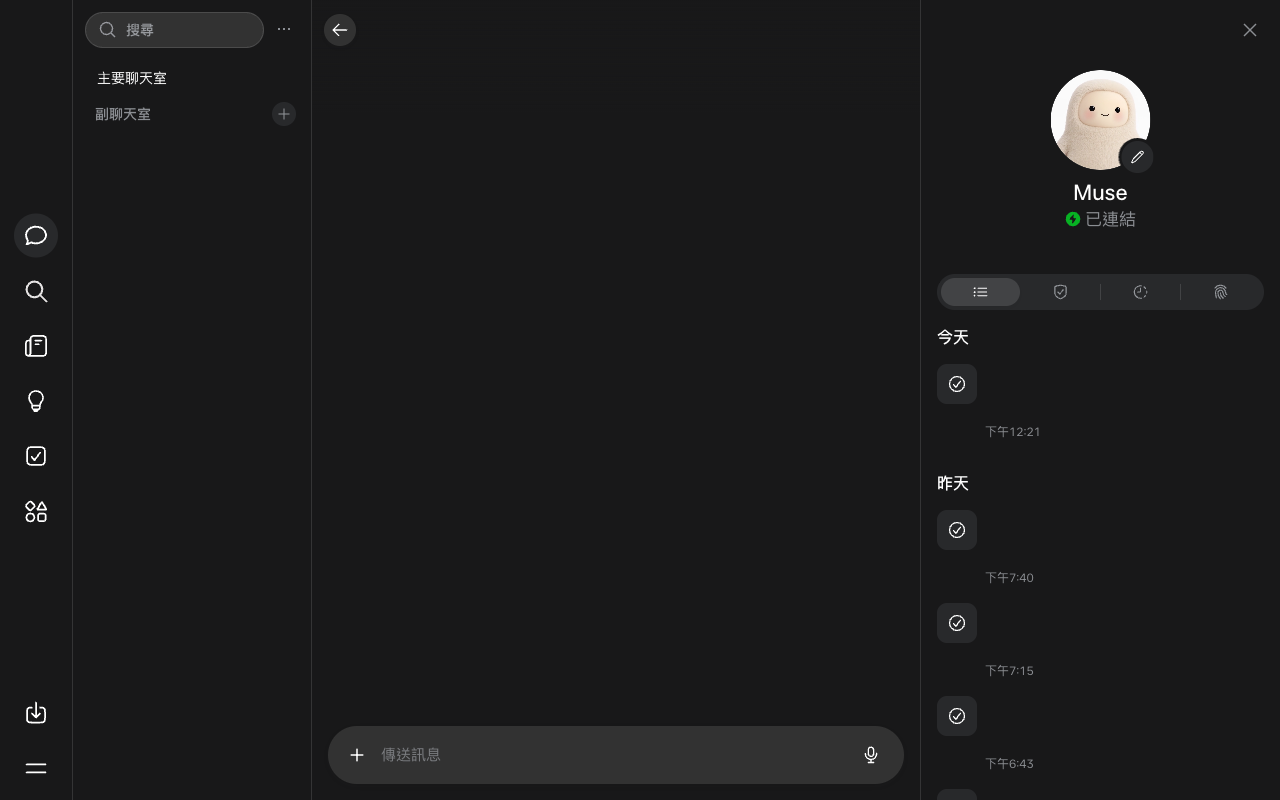
How DeepSeek (DeepSeek) and Muse (Meta) compare on a desktop screen in the week of October 19, 2026: 5 differences and 2 similarities, measured from each product's weekly screenshot.
Open in Compare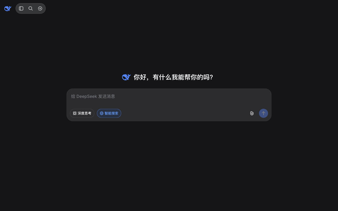
Differences
- DeepSeek shows 5 menu items outside the sidebar; Muse shows 1.
- DeepSeek's message box covers more of the screen than Muse's (9.5% vs 3.3%).
- Muse's sidebar takes 6% of the screen width, DeepSeek shows no sidebar.
- DeepSeek uses 3 text sizes; Muse uses 1.
- DeepSeek's message box sits in the middle third of the screen, Muse's in the bottom third.
Similarities
- Neither shows a note about the AI's limits.
- Both were captured in dark mode.
Latest menu changes
DeepSeek
No menu changes have been recorded for DeepSeek yet.
Muse
No menu changes have been recorded for Muse yet.