Claude
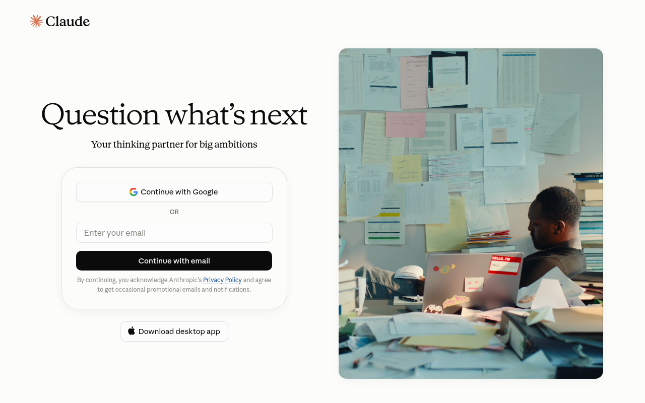
Design analysis
The Claude landing page features a clean and simple layout, with a prominent call-to-action (CTA) that guides the user to the primary action. The page is divided into two main sections: a header with the Claude logo and a navigation bar, and a content section that occupies most of the page. The content section is further divided into two parts: a hero section with a large image and a brief description of the product, and a call-to-action section with a prominent button and a brief paragraph of text. The use of colour and typography is consistent throughout the page, with a neutral colour scheme and a clean sans-serif font. The visual hierarchy is well-organized, with the CTA standing out prominently at the bottom of the page. Overall, the design is simple, intuitive, and effective in guiding the user to the primary action.