Claude
Design analysis
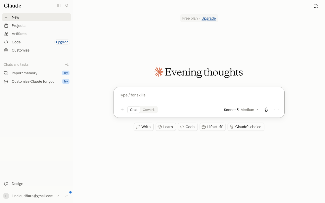
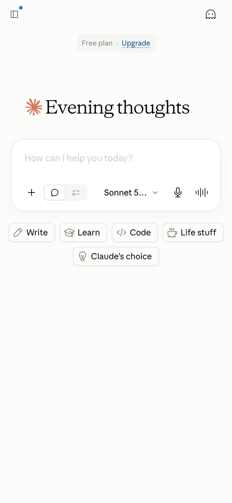
The landing page of Claude by Anthropic presents a clean and organized layout, with a clear visual hierarchy that guides the user's attention. The page is dominated by a prominent call-to-action (CTA) button, "Try," which is displayed in a large, bold font and positioned at the center of the page. The CTA is surrounded by a subtle gradient effect, drawing the user's eye towards it. The background of the page is a clean white, providing a neutral backdrop for the Claude logo and other design elements. The use of a sans-serif font throughout the page adds to the overall sense of simplicity and modernity. While the design is generally well-executed, there are some areas for improvement. For example, the navigation menu could be made more prominent, and the use of a single color scheme may make the page feel a bit too monotonous. Additionally, the placement of the Claude logo at the top-left corner of the page feels slightly awkward, and could be repositioned to create a more balanced composition. Overall, however, the design of the Claude landing page is effective in guiding the user towards the primary action of trying the service, and sets a positive tone for the user's experience.