DeepSeek
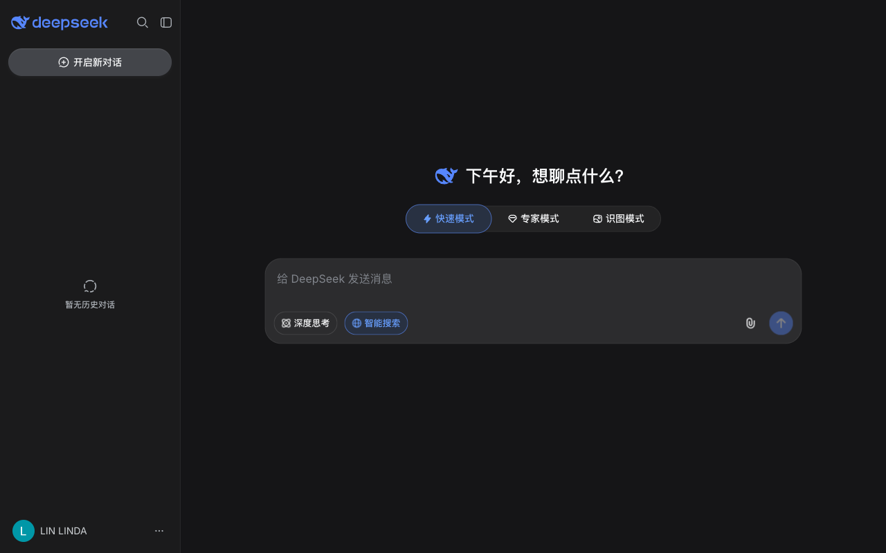

Design analysis
The landing page of DeepSeek presents a clean and organized layout, with a clear visual hierarchy that guides the user's attention to the primary action. The use of a dark grey background and white text creates a sense of contrast and makes the content stand out, while the bold blue text and icons add a touch of vibrancy and energy. The typography is clear and easy to read, with headings and subheadings that provide a clear structure to the content. The layout is well-balanced, with ample white space that prevents the page from feeling cluttered or overwhelming. The primary action, which is to sign up or log in, is prominently displayed at the top of the page, making it easy for users to take the desired action. Overall, the design is well-executed and effectively communicates the value proposition of DeepSeek in a clear and concise manner.