Gemini
Design analysis
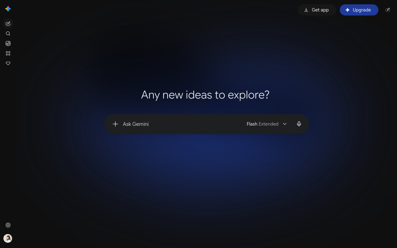
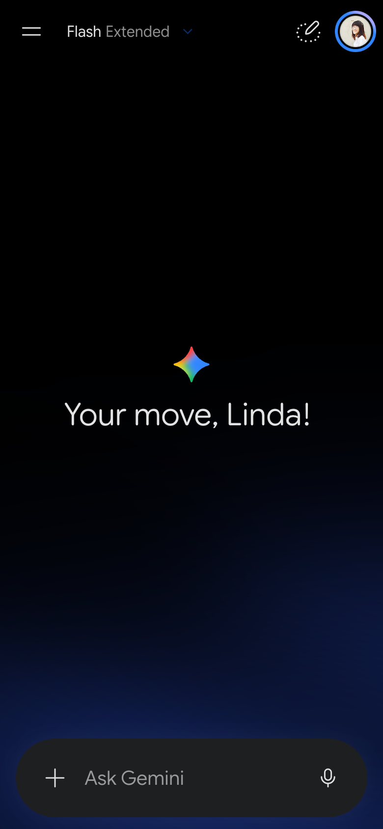
The landing page of Gemini by Google is a well-designed interface that effectively guides users to the primary action of exploring new ideas. The layout is clean and simple, with a prominent call-to-action (CTA) button at the top right corner that reads "Upgrade" in white text on a blue background, drawing the user's attention to the most important action. The visual hierarchy is clear, with the CTA standing out against the dark blue background, while the rest of the page features a subtle gradient effect that adds depth without overwhelming the user. The use of colour is limited to blue and white, creating a sense of professionalism and trustworthiness, while the typography is simple and easy to read, with headings in a clean sans-serif font and body text in a clear, legible font. Overall, the design is effective in guiding the user to the primary action without overwhelming them with unnecessary elements or distractions.