Grok
Design analysis
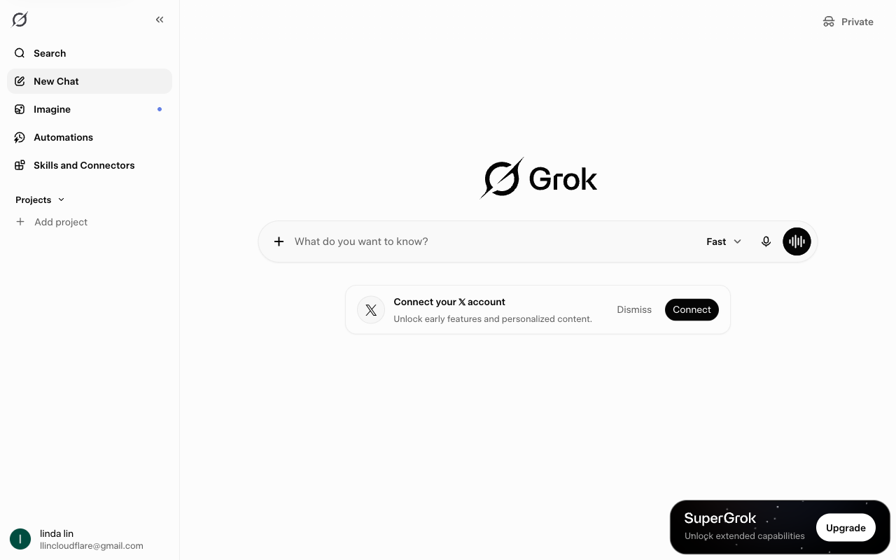
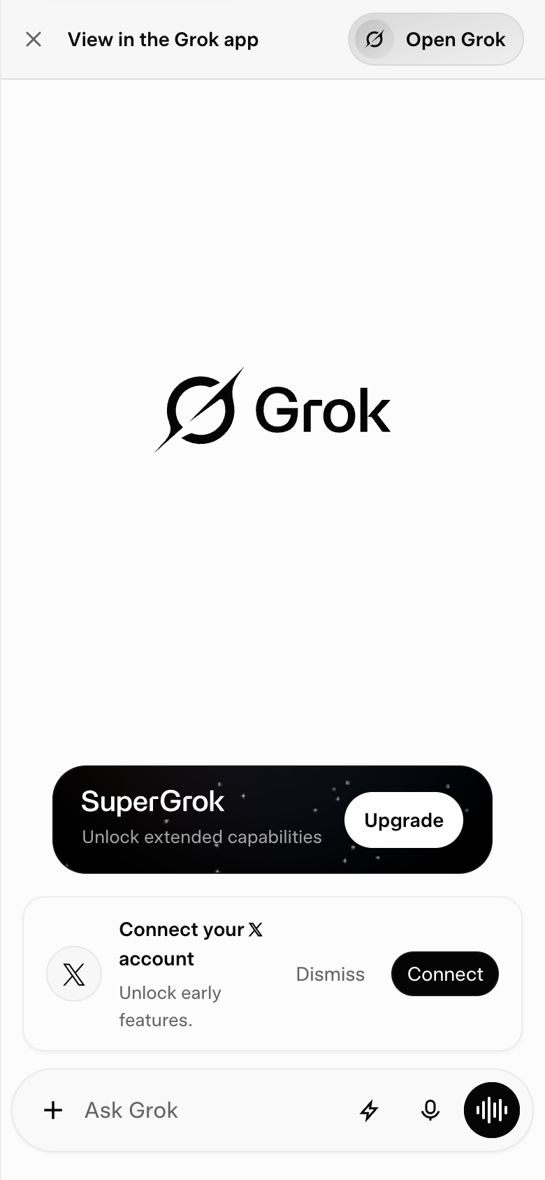
The landing page of Grok by xAI presents a clean and modern design, with a clear visual hierarchy that effectively guides the user's attention to the primary action. The layout is divided into distinct sections, each with its own typography and colour scheme, creating a sense of balance and harmony. The use of a prominent logo in the top-left corner establishes brand recognition, while the search bar and navigation menu are strategically placed to facilitate easy access to the platform's features. The primary action, "Connect your X account," is prominently displayed in a large, bold font, making it impossible to miss, and is accompanied by a clear call-to-action (CTA) button that encourages users to take the next step. The overall design is well-executed, but some users may find the abundance of white space overwhelming, and the lack of visual interest in certain areas could be improved with the addition of icons or graphics. Despite these minor criticisms, the design effectively communicates the platform's purpose and invites users to engage with the product.