Grok
Design analysis
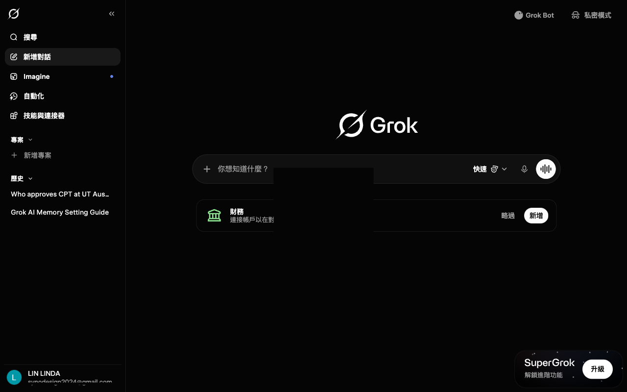
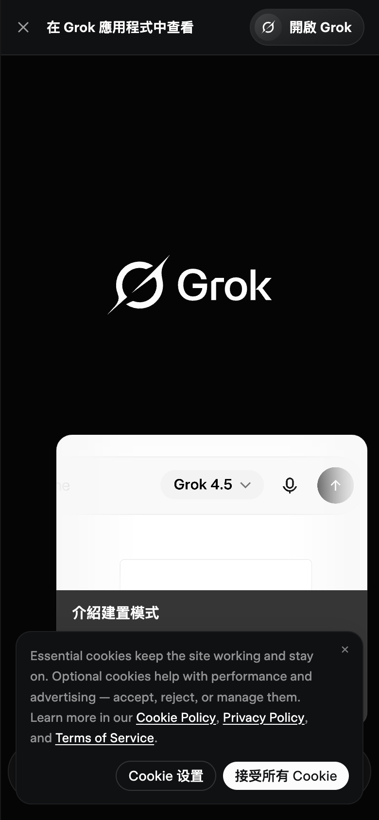
The landing page of Grok by xAI is a masterclass in UI design, with a layout that effectively guides the user's attention to the primary action. The use of a clean and minimalist aesthetic, with a predominantly white and black color scheme, creates a sense of simplicity and approachability. The visual hierarchy is well-balanced, with the Grok logo prominently displayed at the top left, drawing the user's eye towards the center of the page. The typography is clear and easy to read, with a clear distinction between headings and body text. However, the lack of contrast between the white text and the black background in the search bar makes it difficult to read, and the search bar itself is positioned too high on the page, competing with the logo for attention. Despite these minor criticisms, the overall design is well-executed and effectively guides the user to the primary action of searching for information.