Manus
Design analysis
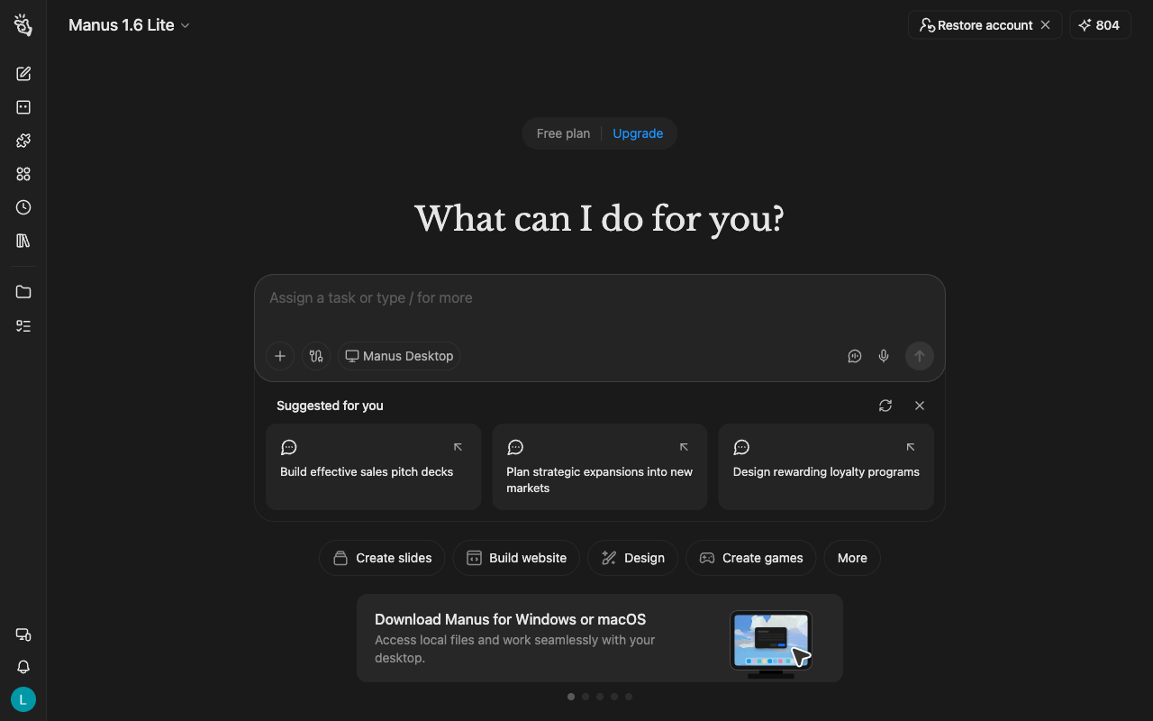
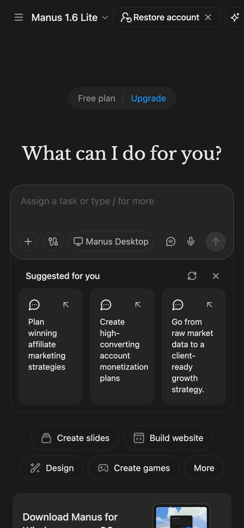
The landing page of Manus by Manus AI presents a clean and modern design, with a clear visual hierarchy that effectively guides the user to the primary action. The layout is organized into distinct sections, with the hero section prominently featuring a large image and concise headline that immediately communicates the product's value proposition. The use of a muted color scheme, including shades of gray, white, and black, creates a professional and sophisticated atmosphere, while the typography is clean and easy to read, with headings and subheadings that provide clear visual cues. The primary action, "Upgrade," is prominently displayed in a large, bold font, making it difficult to miss, and the surrounding elements, such as the call-to-action button and supporting text, are carefully arranged to draw the user's attention to the desired outcome. Overall, the design is well-executed and effectively communicates the product's benefits and encourages the user to take action.