Manus
How the Manus UI changed
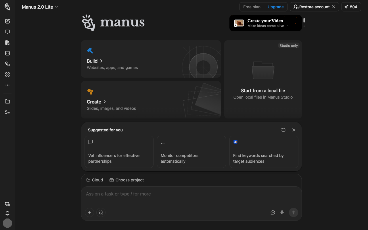
- November 2, 2026 — Icon button (cog-shaped icon) removed from the side menu
- October 26, 2026 — Button icon in the side menu changed (circle-line-square icon → code-window icon)
- September 28, 2026 — Icon button (square-face icon) removed from the side menu; Icon button (puzzle-piece icon) removed from the side menu; Icon button (clock icon) removed from the side menu; Icon button (monitor icon) added to the side menu; Icon button (filled blob icon) added to the side menu; Icon button (mixed-shapes icon) added to the side menu; Icon button (linked-squares icon) added to the side menu; Icon button (three-dot icon) added to the side menu; Icon button (boxed logo icon) added to the side menu; Upgrade added to the bar across the top; Manus Desktop removed from the message box; Cloud added to the message box; Choose project added to the message box
Design analysis
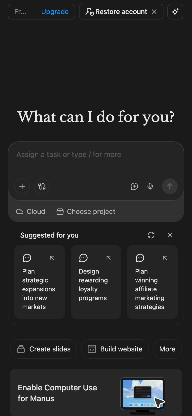
This shows the desktop version of Manus for the week of 2026-11-02, before scrolling. Three large cards fill the top half, offering to build, create, or open a local file. The message box sits near the bottom of the screen. The main text stands out enough from the background to meet a common accessibility guideline. The hint text has less contrast than a common accessibility guideline recommends. The outline of the message box is hard to see. There are three suggested prompts. No note that it can make mistakes is visible on this screen. An icon button (cog-shaped icon) no longer appears in the sidebar.