Le Chat
Design analysis
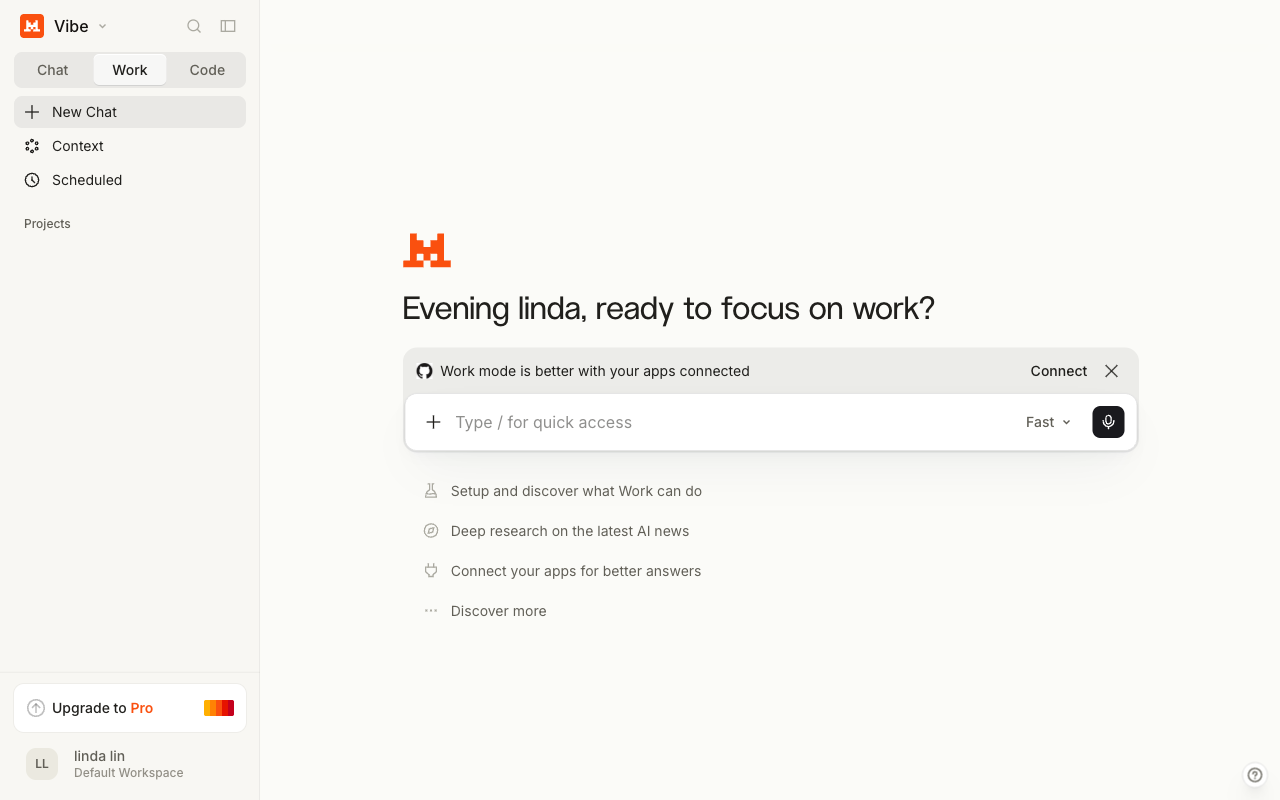
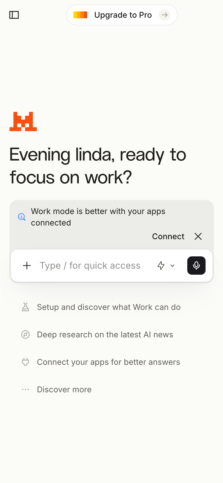
The landing page of Le Chat by Mistral AI presents a clean and organized layout, with a clear visual hierarchy that guides the user's attention to the primary action. The use of a calming color scheme, featuring shades of blue and gray, creates a professional and trustworthy atmosphere, while the prominent display of the chatbot's name and tagline effectively communicates the product's purpose. The typography is clear and easy to read, with headings and subheadings that provide a clear structure to the content. However, the page could benefit from a more prominent call-to-action (CTA) to encourage users to start a conversation with the chatbot, as the current CTA is somewhat buried in the content. Overall, the design effectively communicates the product's value proposition and invites users to engage with the chatbot, but could be improved with a more prominent CTA.