Poe
Design analysis
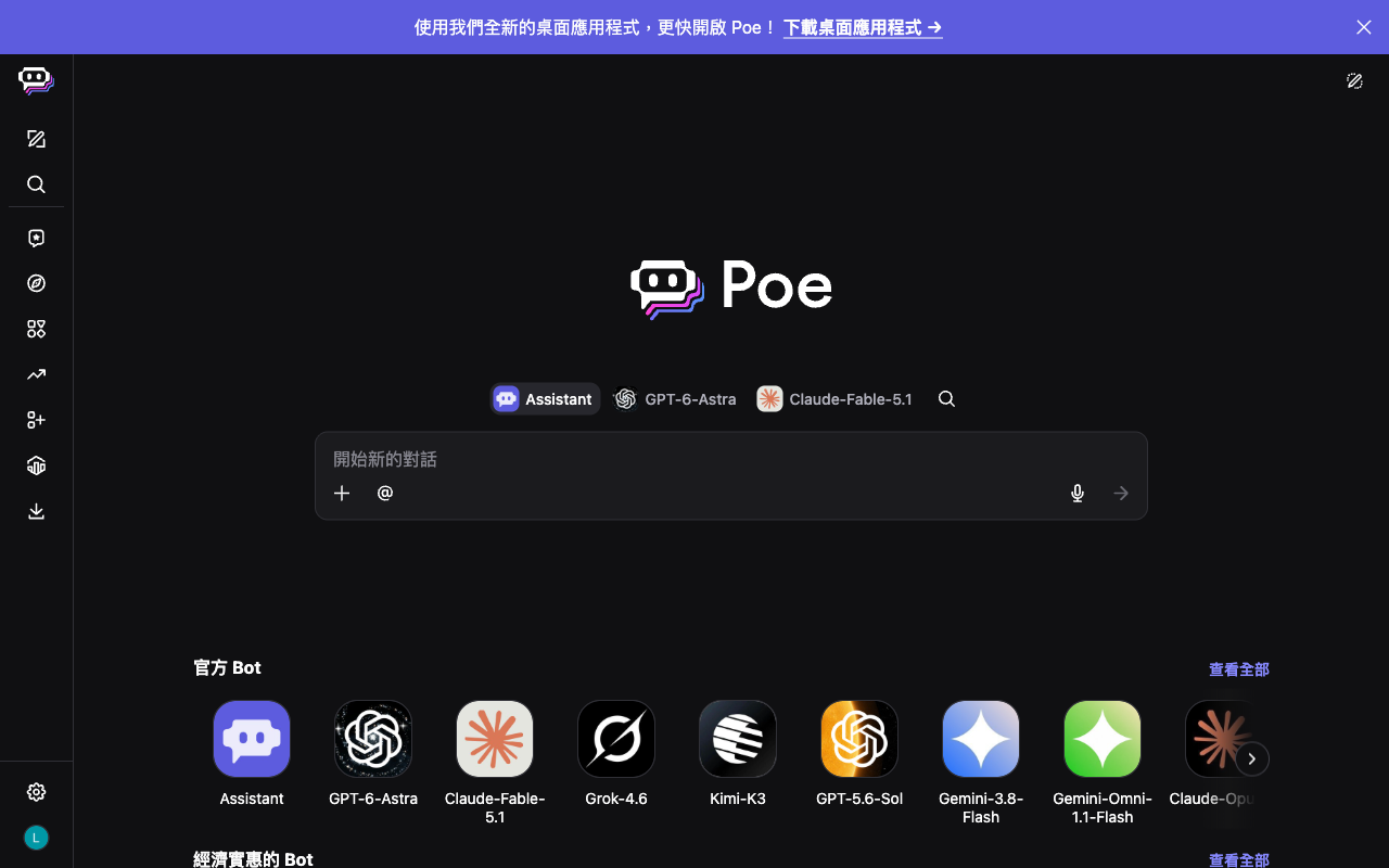
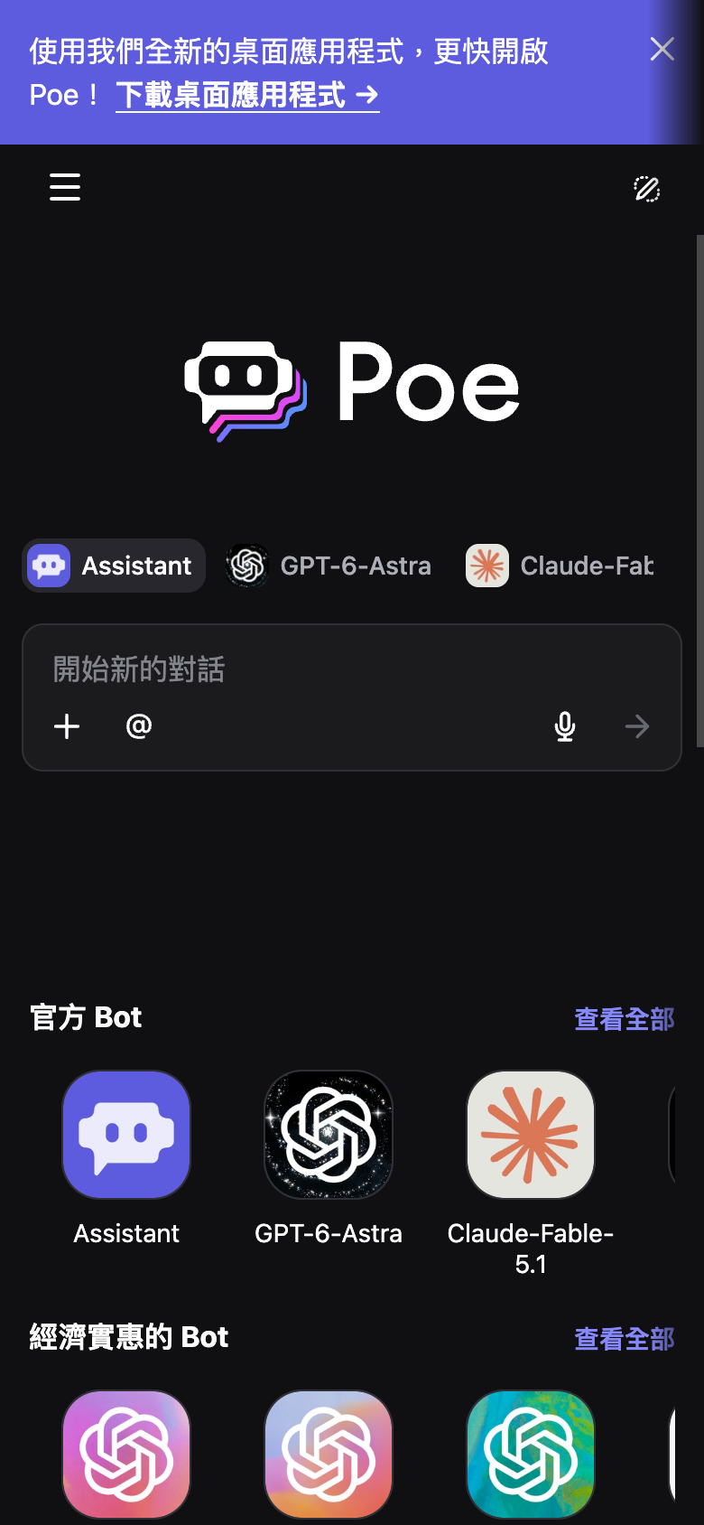
The landing page of Poe by Quora is a masterclass in UI design, with a layout that effectively guides the user's attention towards the primary action. The visual hierarchy is well-balanced, with the Poe logo prominently displayed at the top, accompanied by a clear and concise tagline that sets the tone for the platform. The use of colour is strategic, with a bold and vibrant palette that draws the user's eye towards the call-to-action (CTA) button, which is strategically placed below the logo. The typography is clean and modern, with a clear and readable font used throughout the page, making it easy for users to quickly scan and understand the content. However, the page could benefit from a more subtle use of colour, as the bright purple used for the CTA button may be overwhelming for some users. Additionally, the use of icons could be more consistent, as the icons used for the different features and tools are not uniform in style or design. Overall, the landing page of Poe by Quora is a well-designed and effective UI that successfully guides the user towards the primary action.