Poe
Design analysis
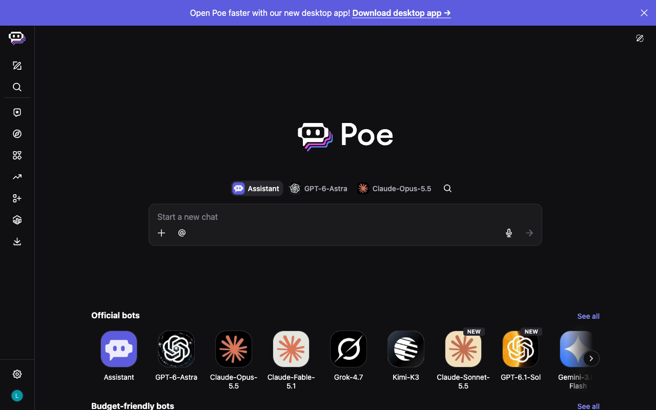
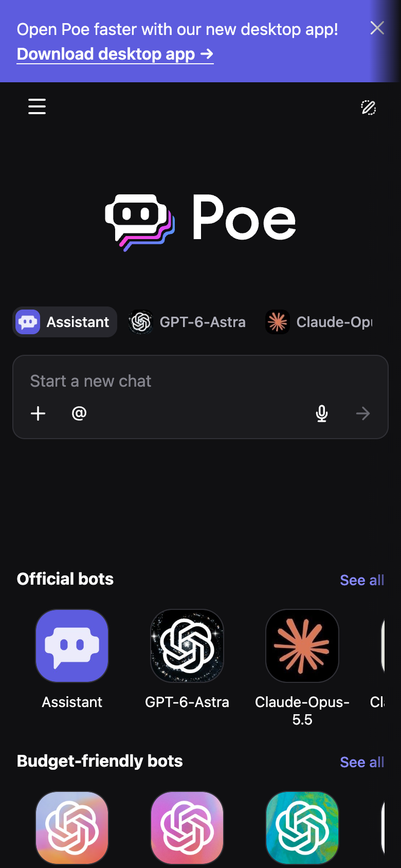
This shows the desktop version of Poe for the week of 2026-09-28, before scrolling. A narrow sidebar of icons runs down the left side. A purple banner across the top and the message box stand out most. All measured text is light enough against the dark background to meet a common accessibility guideline. The outline of the message box is faint, but the hint text inside it is easy to read. The message box says "Start a new chat". There are no suggested prompts. There is no note that it can make mistakes. The main screen looks the same as the week of 2026-09-21.