Qwen Chat
Design analysis
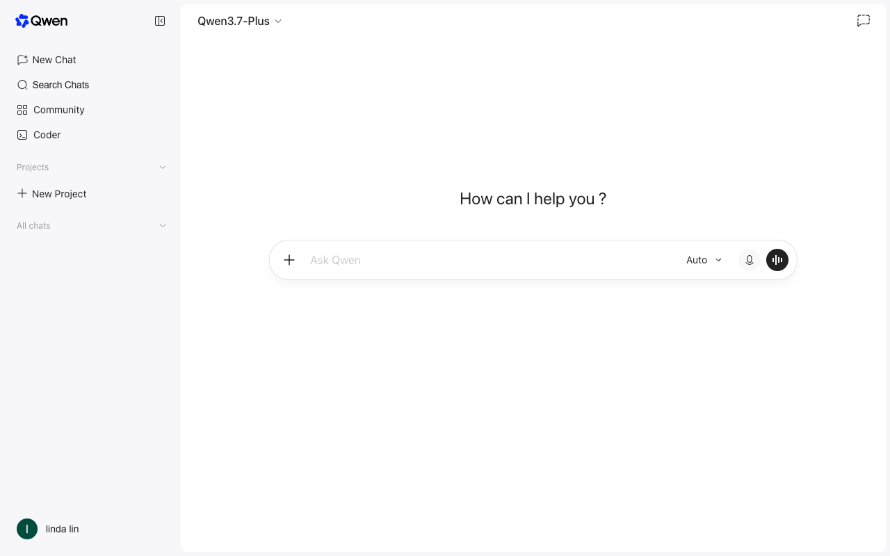
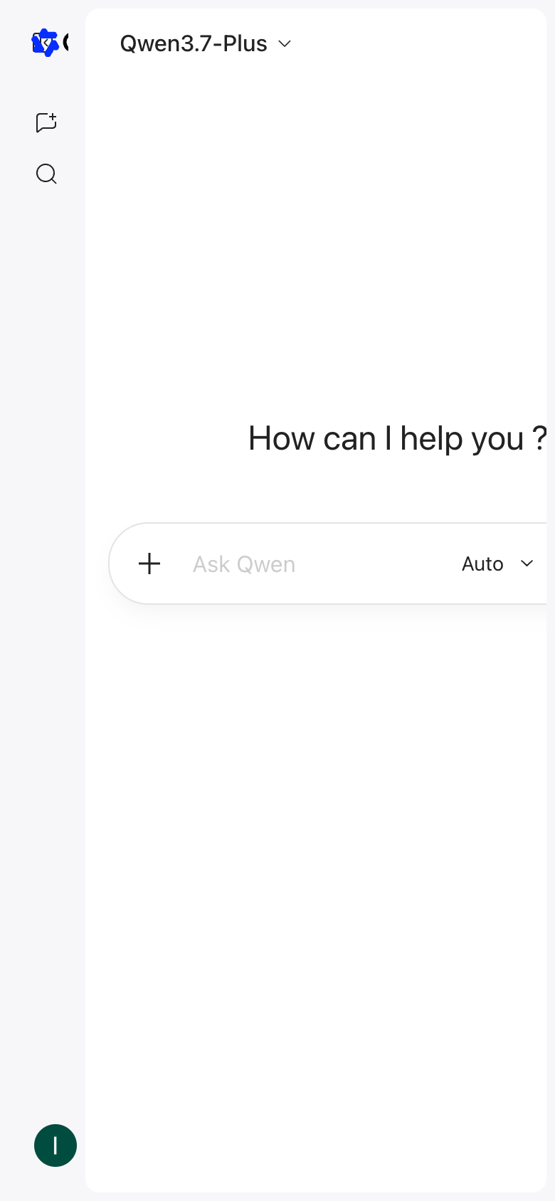
The landing page of Qwen Chat by Alibaba presents a clean and intuitive design that effectively guides the user to the primary action. The layout is organized into clear sections, with the main navigation menu on the left and the search bar at the top, creating a visual hierarchy that draws attention to the primary action of searching for a chat. The use of a light grey background and black text creates a neutral and calming atmosphere, while the prominent display of the search bar in black and the "Ask Qwen" button in dark green effectively communicates the purpose of the page and encourages users to take action. However, the lack of visual interest and the absence of any distinctive branding elements make the design feel somewhat generic and unremarkable. Answer: The landing page of Qwen Chat by Alibaba presents a clean and intuitive design that effectively guides the user to the primary action. The layout is organized into clear sections, with the main navigation menu on the left and the search bar at the top, creating a visual hierarchy that draws attention to the primary action of searching for a chat. The use of a light grey background and black text creates a neutral and calming atmosphere, while the prominent display of the search bar in black and the "Ask Qwen" button in dark green effectively communicates the purpose of the page and encourages users to take action. However, the lack of visual interest and the absence of any distinctive branding elements make the design feel somewhat generic and unremarkable.