Manus vs Poe: UI comparison
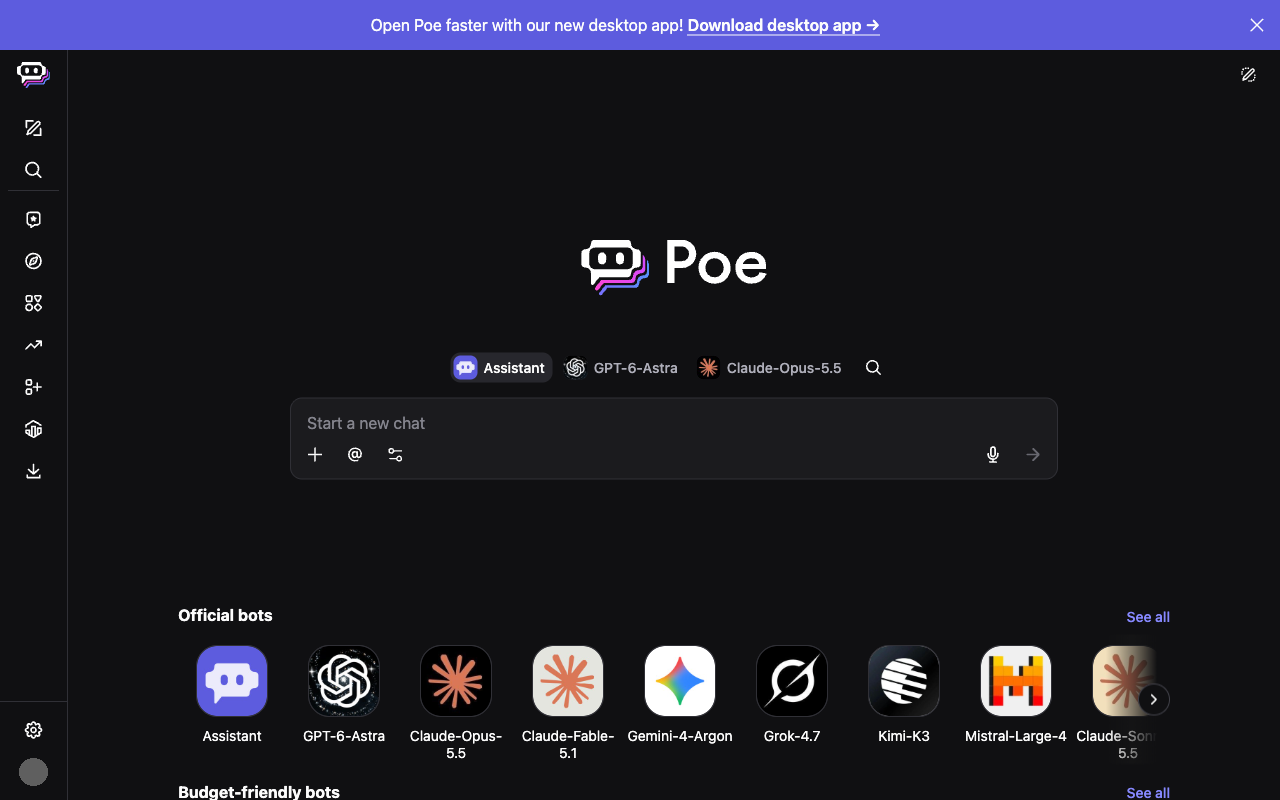
How Manus (Manus AI) and Poe (Quora) compare on a desktop screen in the week of October 19, 2026: 3 differences and 4 similarities, measured from each product's weekly screenshot.
Open in Compare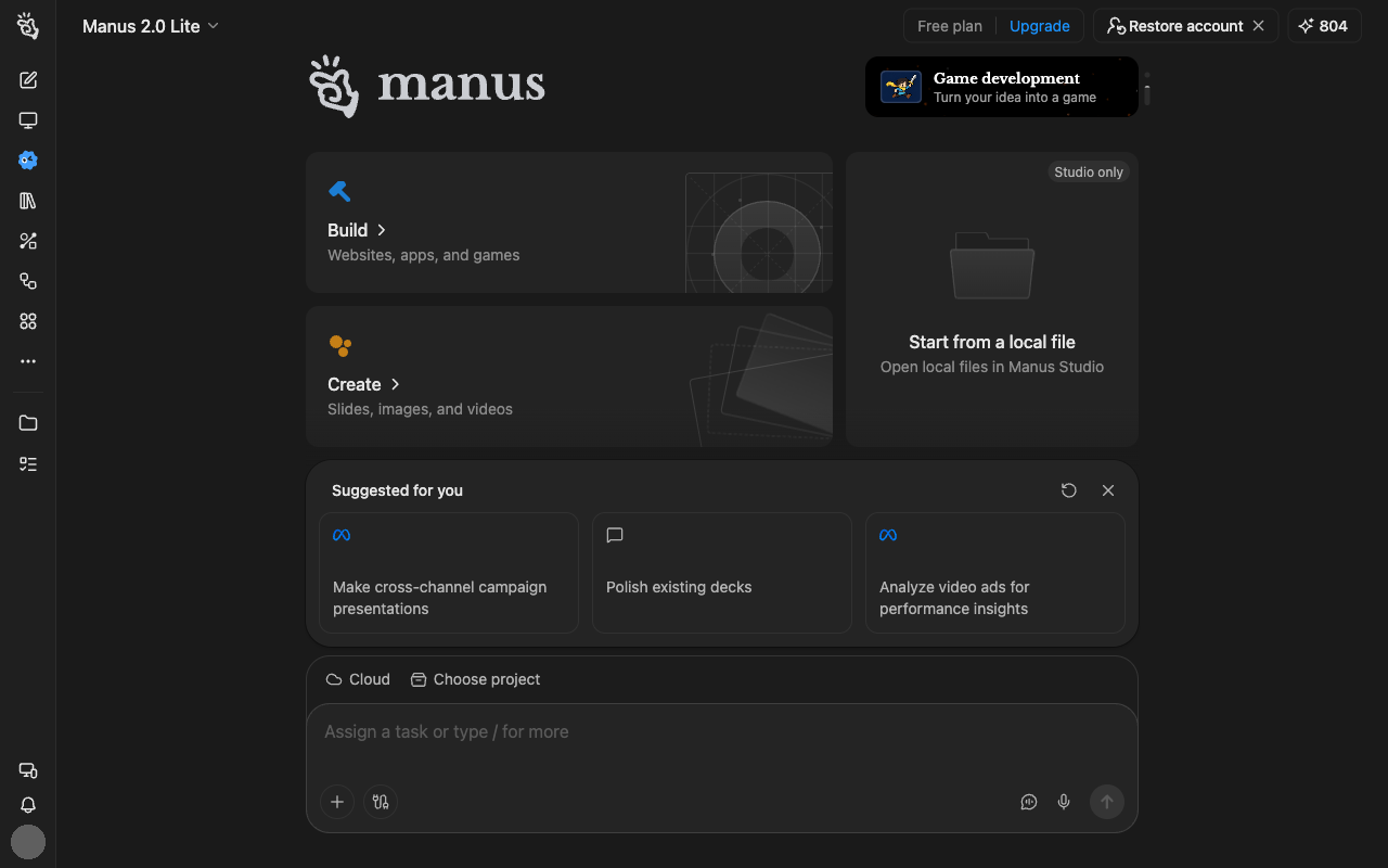
Differences
- Manus shows 17 menu items; Poe shows 13.
- Manus's message box covers more of the screen than Poe's (9% vs 6.2%).
- Manus's message box sits in the bottom third of the screen, Poe's in the middle third.
Similarities
- Both sidebars take a similar share of the screen width (4% vs 5%).
- Both use 3 text sizes.
- Neither shows a note about the AI's limits.
- Both were captured in dark mode.
Latest menu changes
Manus
No menu changes have been recorded for Manus yet.
Poe
Week of October 5, 2026, compared with the week of September 28, 2026:
- An icon button (slider icon) now appears in the input area.