Kimi
Design analysis
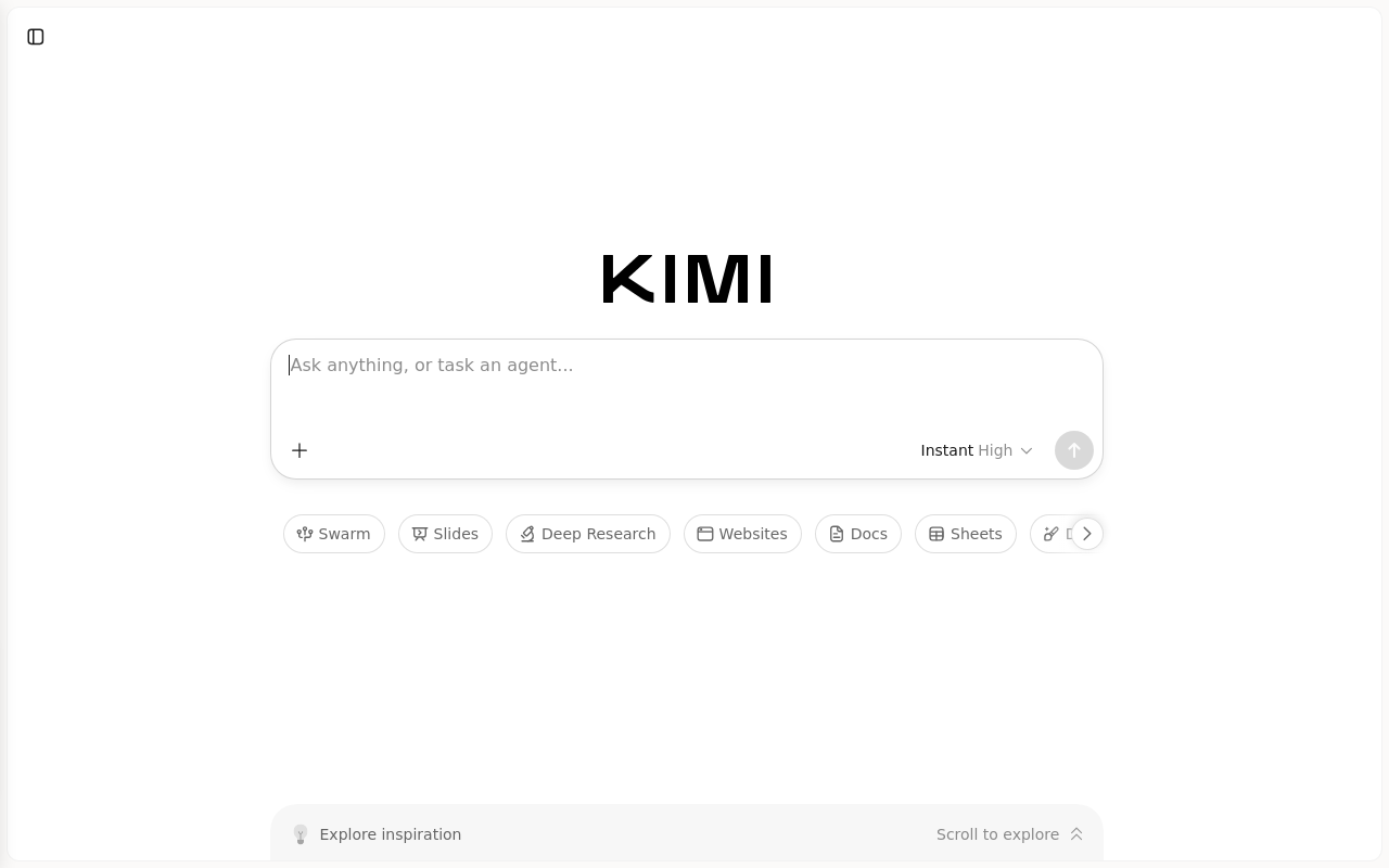
The landing page of Kimi by Moonshot AI features a clean and minimalistic layout, with a prominent title in large black font at the top, accompanied by a search bar that immediately draws the user's attention. The visual hierarchy is clear, with the title and search bar standing out against the white background, while the secondary navigation menu is subtly integrated into the footer. The use of color is limited to black and white, which creates a sense of simplicity and professionalism. However, the typography could be improved by using a more modern sans-serif font to enhance readability and visual appeal. Overall, the design effectively guides the user to the primary action of searching for inspiration, making it easy for them to navigate and explore the platform.