Kimi
Design analysis
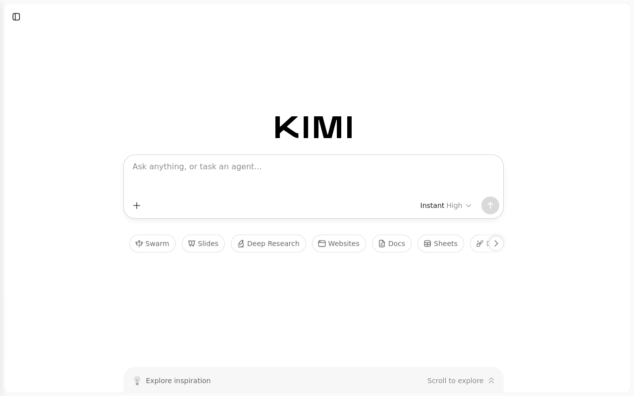
The landing page of Kimi by Moonshot AI features a clean and minimalistic design, with a predominantly white background that effectively guides the user's attention to the primary action. The use of a large, bold font for the brand name "Kimi" creates a clear visual hierarchy, while the subtle use of a light gray color for the background and text provides sufficient contrast without overwhelming the user. The layout is well-organized, with a prominent call-to-action (CTA) button in the center of the page that invites the user to "Ask anything, or task an agent..." The typography is clear and easy to read, with a consistent font size and style throughout the page. However, the design could benefit from a more prominent display of the platform's benefits and features, as well as a clearer indication of the user's next steps after clicking the CTA button. Overall, the design is effective in conveying the platform's purpose and encouraging user interaction, but could be improved with additional visual elements and clearer guidance.