Kimi
Design analysis
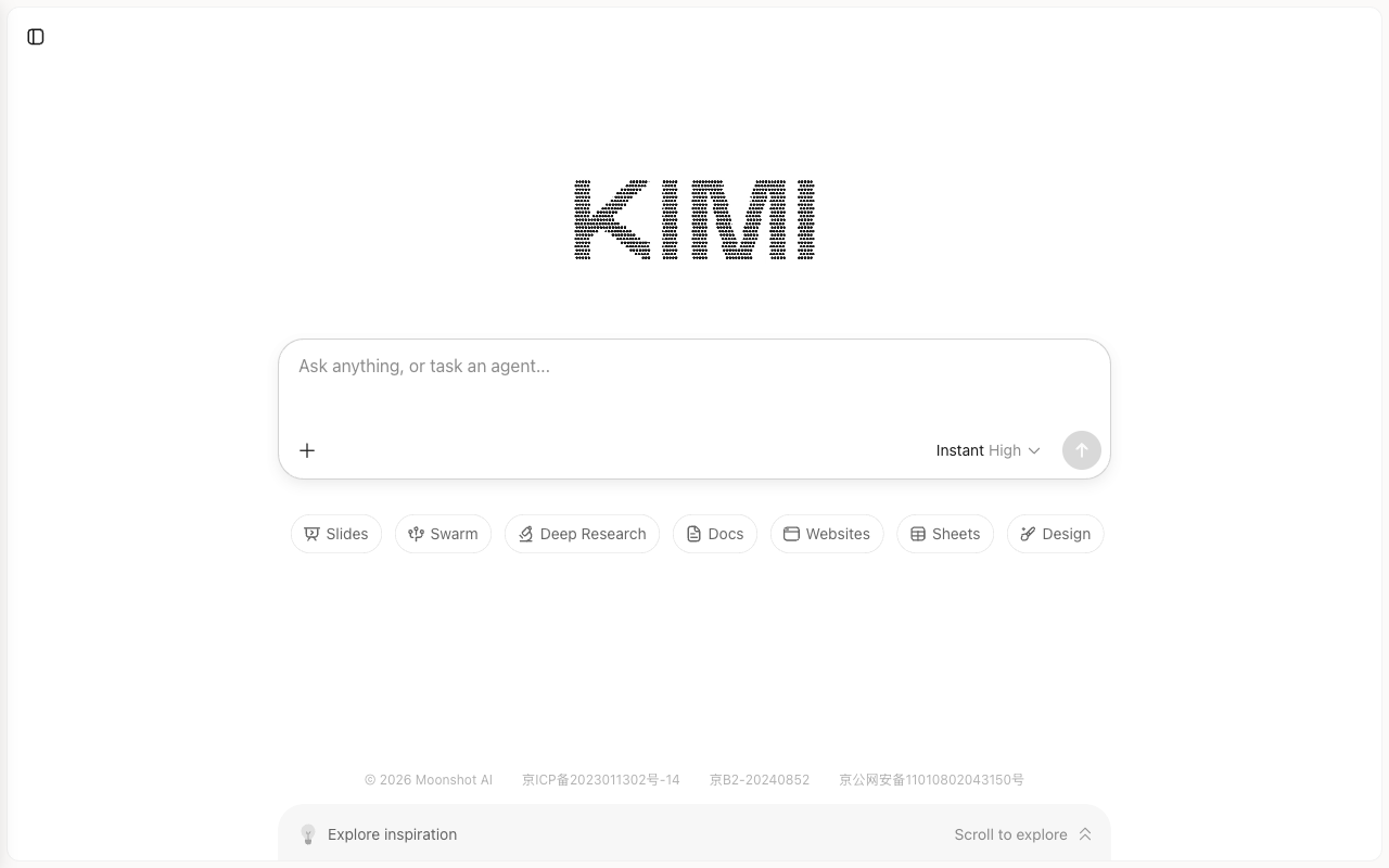
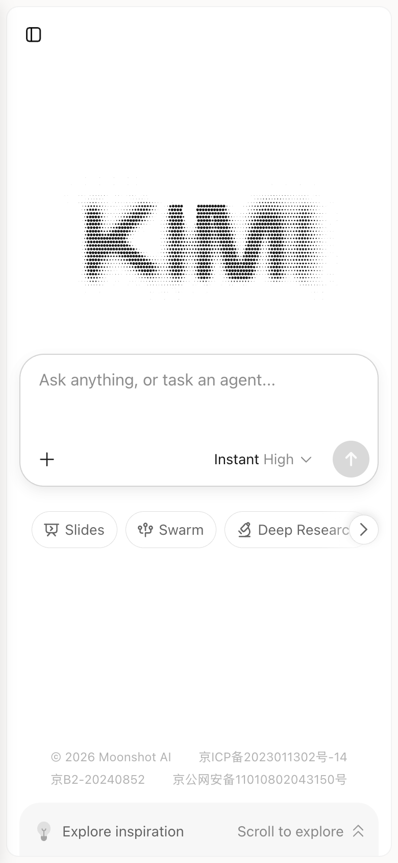
The Kimi landing page by Moonshot AI presents a clean and minimalist design that effectively guides the user to the primary action. The layout is organized into two distinct sections: a prominent search bar at the top, accompanied by a list of suggested features below. The use of colour is limited to a subtle grey tone, which provides a neutral background for the content. The typography is clear and easy to read, with a sans-serif font used throughout. The visual hierarchy is well-defined, with the search bar and suggested features standing out as the most prominent elements. However, the page could benefit from more whitespace to improve readability and reduce visual clutter. Overall, the design is functional and efficient, making it easy for users to quickly find what they're looking for and get started with the platform.