Kimi
Design analysis
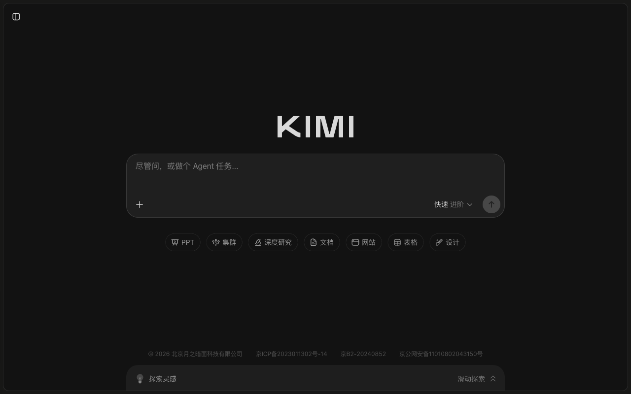
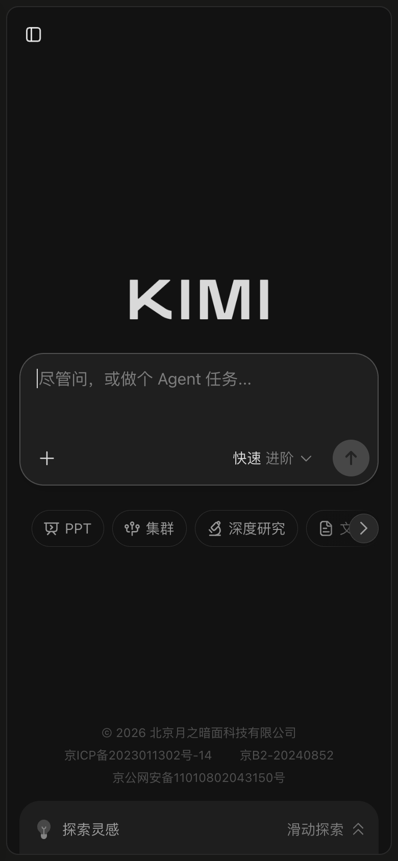
The Kimi landing page by Moonshot AI is a masterclass in UI design, with a clean layout that effectively communicates the app's purpose. The visual hierarchy is well-organized, with the "Kimi" logo prominently displayed in a bold, sans-serif font, while the "Agent" button and other secondary elements are presented in a smaller, yet still clear, sans-serif font. The use of a dark grey background and white text creates a sense of professionalism and sophistication, while the subtle gradient effect adds a touch of modernity. The typography is well-balanced, with the logo font being more condensed and the body text font being more expanded, making it easy to read and understand. The layout guides the user's attention to the "Agent" button, which is strategically placed at the top of the page, making it the primary call-to-action. Overall, the design is both functional and aesthetically pleasing, setting the tone for a user-friendly and engaging experience.