Kimi
Design analysis
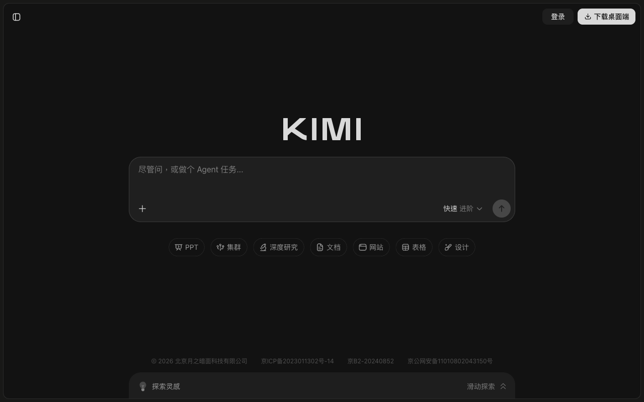
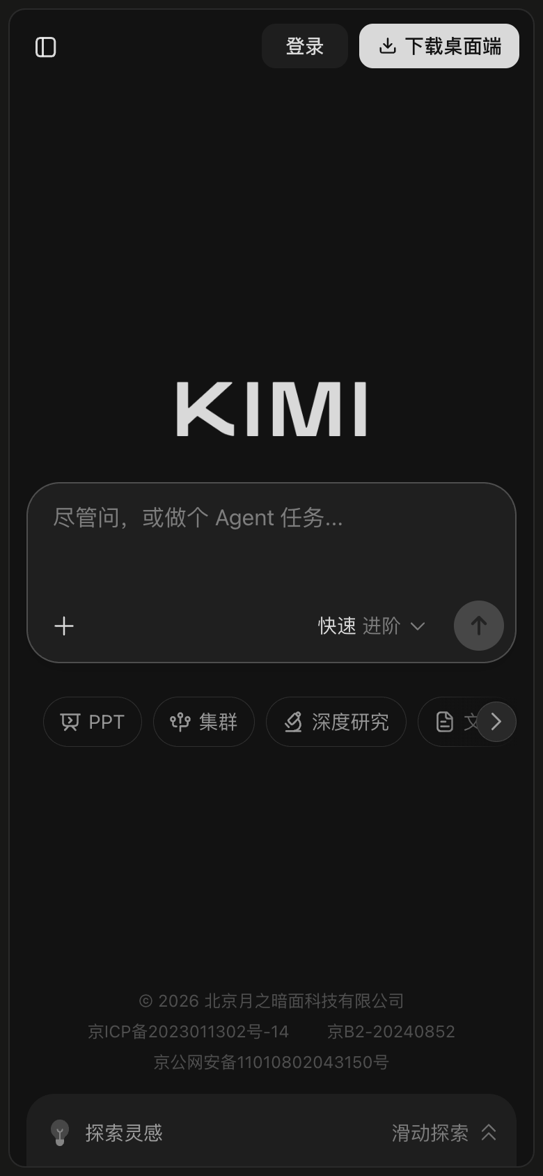
The landing page of Kimi by Moonshot AI is a masterclass in subtle yet effective design. The layout is clean and uncluttered, with a clear visual hierarchy that guides the user's eye towards the primary action: the search bar. The use of a dark background and light text creates a sense of depth and sophistication, while the use of a single accent colour (a muted green) adds a touch of warmth and approachability. The typography is clear and readable, with a generous font size that makes the content easy to scan. However, the lack of a clear heading or tagline makes it difficult to understand the purpose of the page at a glance, and the search bar could benefit from a more prominent call-to-action (CTA) to encourage users to start searching. Overall, while the design is visually appealing, it could benefit from a bit more clarity and guidance to help users quickly understand the value proposition and jump into action.