Kimi
Design analysis
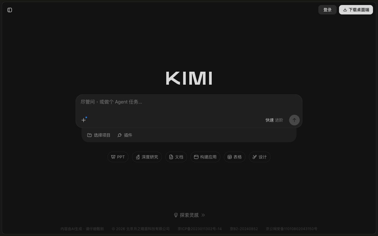
This shows the desktop version of Kimi for the week of 2026-09-21, before scrolling. This is the view for visitors who are not signed in. The dark screen is in Chinese, with a large message box in the middle and no open sidebar. The Kimi logo and the message box stand out most. Below the box are six buttons that show what it can do, like PPT and deep research. The button labels are bright enough against the dark background to meet a common accessibility guideline. The outline of the message box and its hint text are fainter than that guideline recommends. A note at the bottom says answers come from AI, but it is much fainter than recommended.