Manus
Design analysis
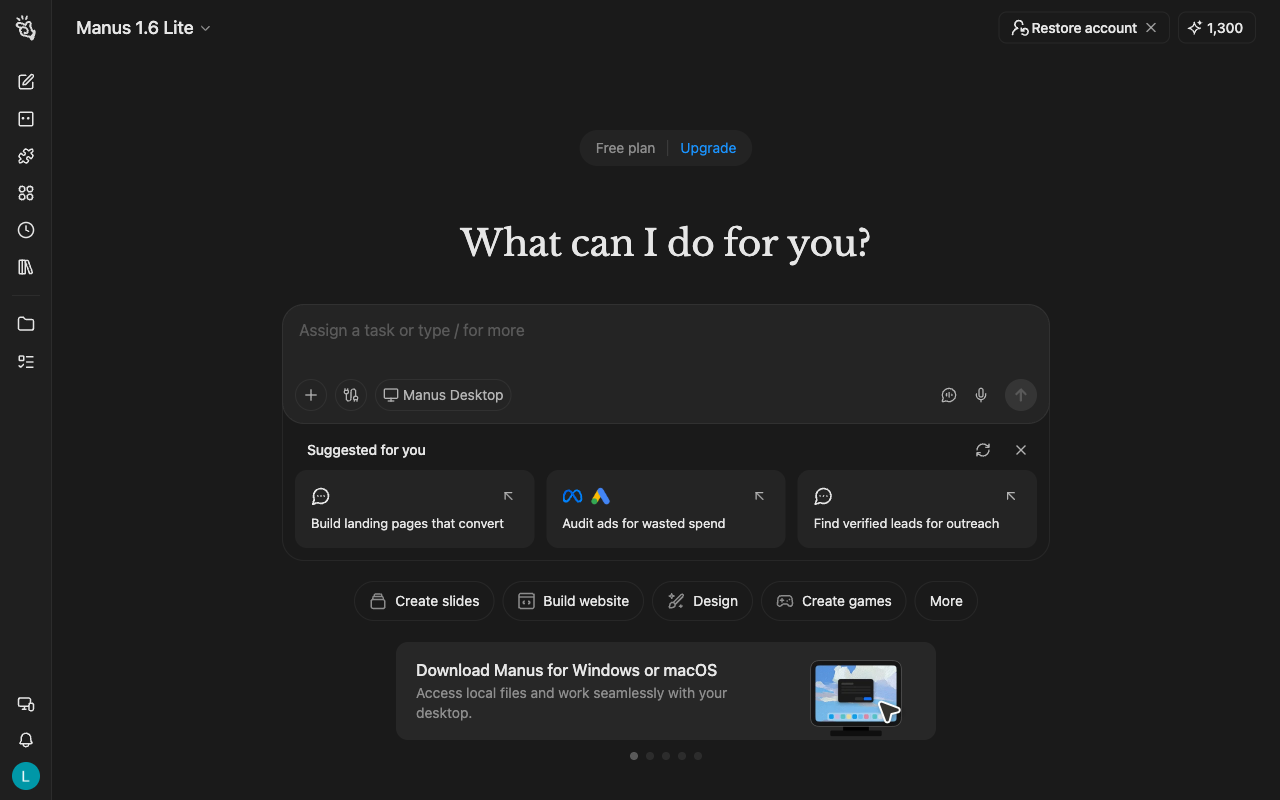
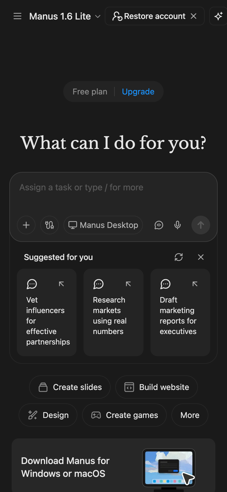
The Manus landing page is a well-designed UI reference library that effectively guides the user to the primary action of signing up for the product. The layout is clean and organized, with a clear visual hierarchy that draws attention to the key elements. The use of colour is limited to a dark grey background, white text, and blue accents, which creates a professional and modern aesthetic. The typography is clear and readable, with headings and subheadings used to break up the content and create a sense of flow. The page is divided into sections, each with its own unique design and purpose, such as the hero section, feature section, and call-to-action section. The overall design is consistent throughout, with a consistent use of icons, buttons, and other UI elements that reinforce the brand's identity. The page also features a prominent call-to-action button that encourages the user to sign up for the product, making it easy for them to take the next step. Overall, the design of the Manus landing page is effective in communicating the value proposition of the product and guiding the user to take action.