Gemini
Design analysis
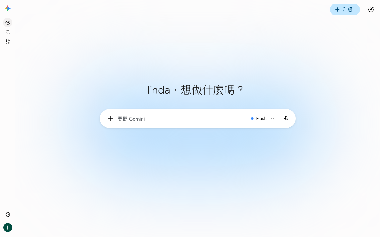
The Gemini landing page by Google is a well-crafted UI that effectively guides the user to the primary action. The layout is clean and simple, with a clear visual hierarchy that draws attention to the search bar and the prominent "Flash" button. The use of colour is limited to a subtle blue gradient, which adds a touch of warmth without overwhelming the user. The typography is clear and readable, with a sans-serif font used throughout. The search bar is the focal point of the page, with the search icon and text input field prominently displayed. The "Flash" button is positioned below the search bar, making it easy for users to access the primary action. Overall, the design is intuitive and user-friendly, making it easy for users to quickly find what they're looking for.