Gemini
Design analysis
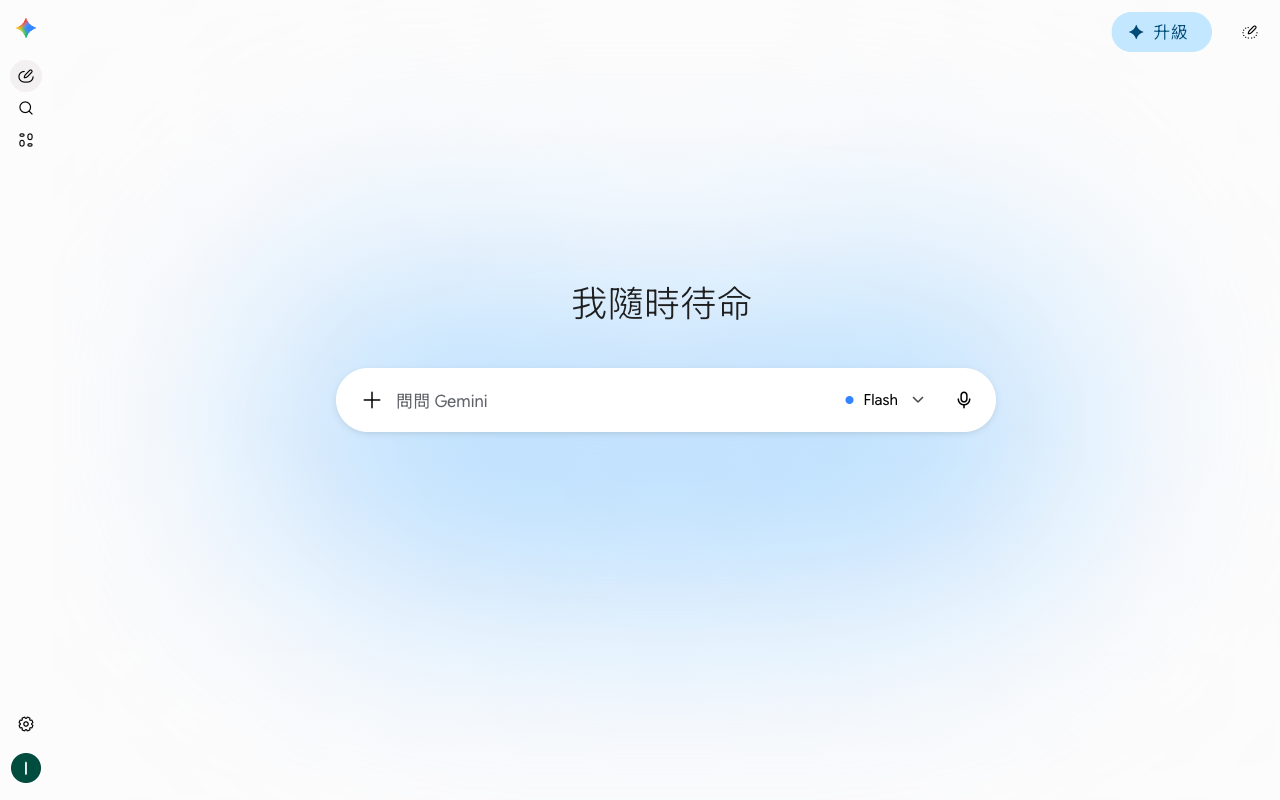
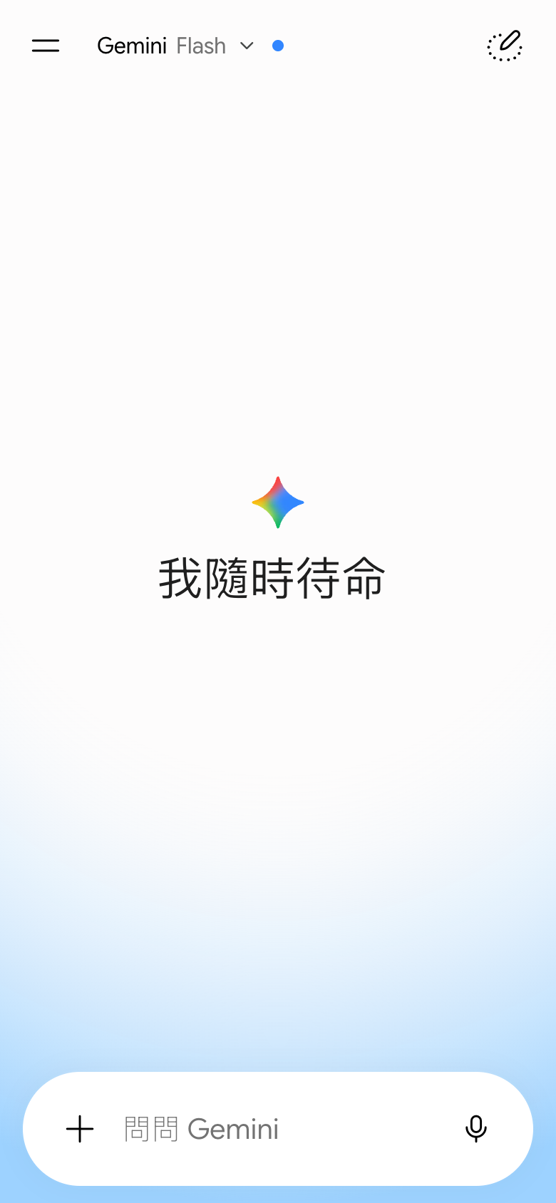
The landing page of Gemini by Google is a masterclass in simplicity and elegance. The layout is clean and uncluttered, with a clear visual hierarchy that immediately draws the user's attention to the primary action: searching for content. The use of a subtle blue gradient background and white text creates a sense of calmness and approachability, while the sans-serif font used throughout the page adds to the overall sense of modernity and sophistication. The prominent placement of the search bar at the top of the page, accompanied by a simple yet effective icon, makes it impossible to miss, guiding the user seamlessly to the primary action without any unnecessary distractions or clutter.