Gemini
Design analysis
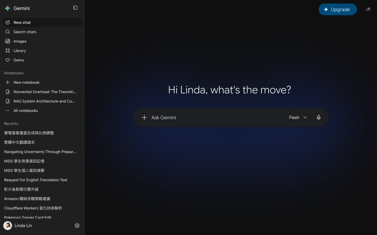
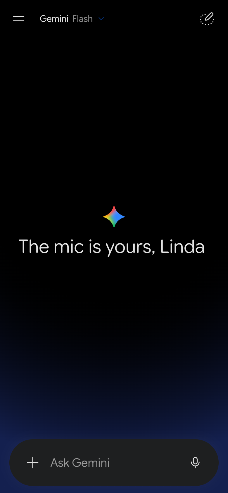
The landing page of Gemini, a Google product, features a clean and modern design that effectively guides users to the primary action. The layout is organized into clear sections, with the search bar prominently displayed at the top, accompanied by a navigation menu on the left-hand side. The visual hierarchy is well-balanced, with headings and subheadings in a clear sans-serif font (likely Open Sans) and a subtle blue accent color used sparingly to draw attention to key elements. The use of negative space and a limited color palette creates a sense of simplicity and focus, while the prominent display of the "Ask Gemini" button in white text on a blue background encourages users to take action. Overall, the design is well-considered and effective in its simplicity, making it easy for users to quickly understand the purpose of the page and navigate to the desired action.