Manus
Design analysis
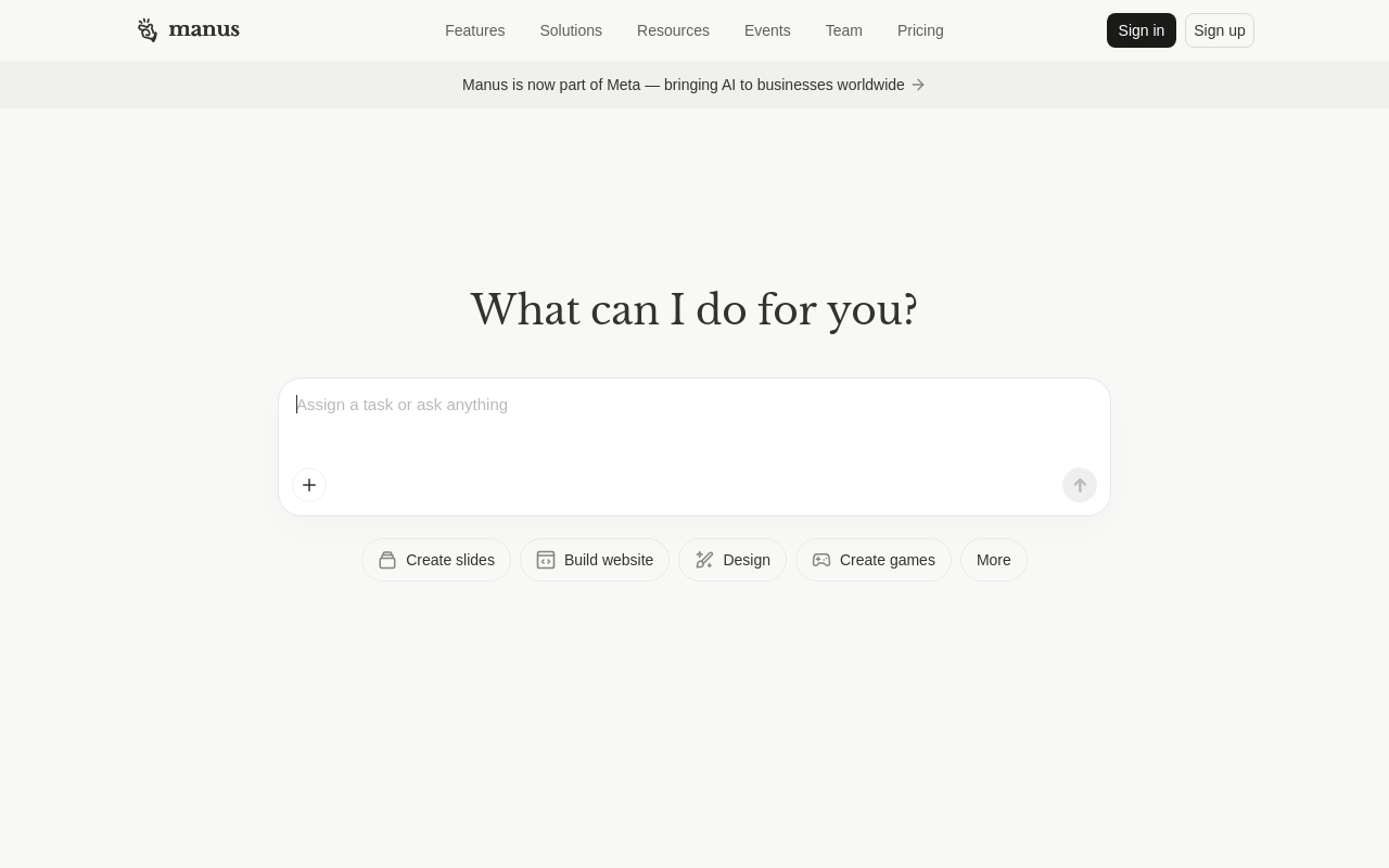
The landing page of Manus by Manus AI presents a clean and modern design that effectively guides the user to the primary action. The layout is simple, with a prominent header featuring the Manus logo and navigation menu, while the main content area is dominated by a large, centered title "What can I do for you?" in a clear, sans-serif font. The visual hierarchy is well-balanced, with the title drawing attention and the supporting text and buttons providing additional context. The use of a single, muted color scheme and subtle gradients creates a cohesive and professional look, while the typography is well-chosen and easy to read. However, the page could benefit from more white space to improve readability and reduce visual clutter. Overall, the design effectively communicates the purpose of the platform and invites users to explore further, making it an effective UI reference library.