Manus
Design analysis
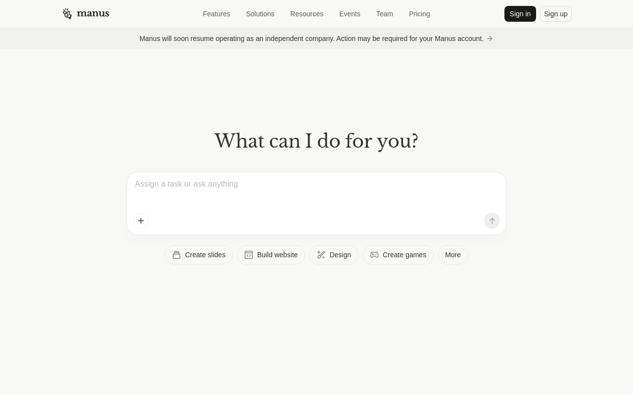
The landing page of Manus by Manus AI is a clean and minimalistic design that effectively guides the user to the primary action. The layout is simple, with a prominent call-to-action (CTA) button "Sign in" or "Sign up" at the top right corner, drawing the user's attention immediately. The visual hierarchy is well-balanced, with the CTA button standing out against a subtle background that features the company logo and a brief tagline. The use of color is limited to a neutral palette, with the exception of the CTA button, which uses a bright accent color to create contrast and encourage action. The typography is clear and readable, with headings and body text displayed in a clean sans-serif font. Overall, the design is well-crafted to quickly communicate the value proposition of Manus and prompt the user to take the next step.